- There’s no more ungainly bulge on the back of the machine.
- It has a spacious 24” 4.5K Retina display.
- It comes in six vibrant and joyful colors, plus a silver option.
- There’s finally a 1080p FaceTime camera!
- The M1 processor makes this thing move at screaming speeds.
- The audio situation is phenomenal—its six-speaker system makes for immersive music and video watching. Heck yeah it can do Spatial Audio!
- 5G!!! 5G 5G 5G 5G 5G…
- A Thunderbolt/USB 4 port.
- An Ultra Wide front camera with a new Center Stage feature. Have the camera automatically follow you around when you’re on a FaceTime call.
- A new Magic Keyboard color: white!
-
Seriously, Apple. We need some pro apps on this thing, and not just what’s provided by developers who are picking up your considerable slack. ↩︎
-
That is to say, money. ↩︎
- The Smart Case is forgettable at best, but it’s mostly just bad. It has a misaligned notch for the charging cable, it offers zero protection for the mesh canopy, and it’s boring. It pales in comparison to the Wireless Charging Case used by the other AirPods.
- This isn’t necessarily a problem with the headphones, but Siri is still lacking. I use it frequently because it’s an easy way to do many things. However, it’s clear there’s still so much potential that’s not being realized. Instead of a personal assistant hugging my ears, I have a somewhat competent robot on my head.
- The incredible Spatial Audio feature isn’t currently available on the Apple TV. This may be more of a limitation with the Apple TV box—it is an older piece of hardware. Having Spatial Audio available to me would make for a great experience that would set it far apart from the competition. This is a massive oversight that Apple needs to fix as soon as possible.
-
In this case, I’m assuming this theoretical person doesn’t sleep on a bed of cash. ↩︎
-
Except he said it in French with a cool French accent. ↩︎
- Did you open the message?
- How many times did you open it?
- What links did you click or tap on in the email?
- What device were you using when you viewed it?
- Where were you when you opened the email?
Spring Loaded
On April 20, Apple hosted their “Spring Loaded” event, in which they debuted several new devices and services. Some offered peculiar iterations, while others are helping to lay the considerable track ahead of Apple’s future.
Much like every other event they’ve held in the past year and change, this one was pre-recorded. It had an extreme amount of polish, an efficiency to their information (its running time came in at about an hour), and some humor and fun were sprinkled throughout. I love the style of these events, and I hope they continue them for a long time to come.
This one was not nearly to the scale of other events they hold throughout the year. It was no WWDC. It was, however, one of a handful of smaller events they typically hold in which they talk about new hardware. This one was no exception.
i. Quick bits
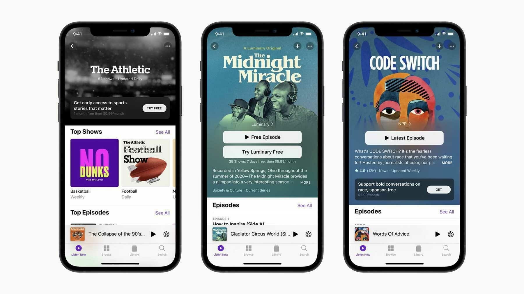
There’s an updated Podcasts app. It includes their new Channels feature, which can collect the various shows of a podcast network under a central banner. Creators are now able to offer subscriptions to premium shows.
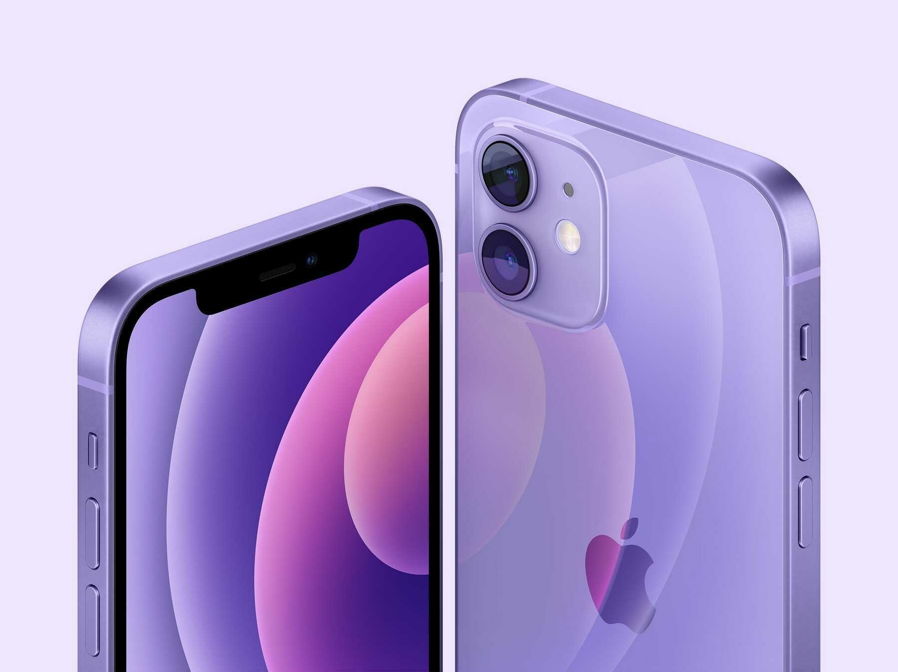
There’s also a lovely new purple iPhone 12. I’ve been using and enjoying a silver iPhone 12 Pro Max, but a color like this purple is making me reconsider my choices. Why can’t the pro phones feature colors like this? Do pro users not like color or personality? Gold just doesn’t cut it!
ii. AirTags
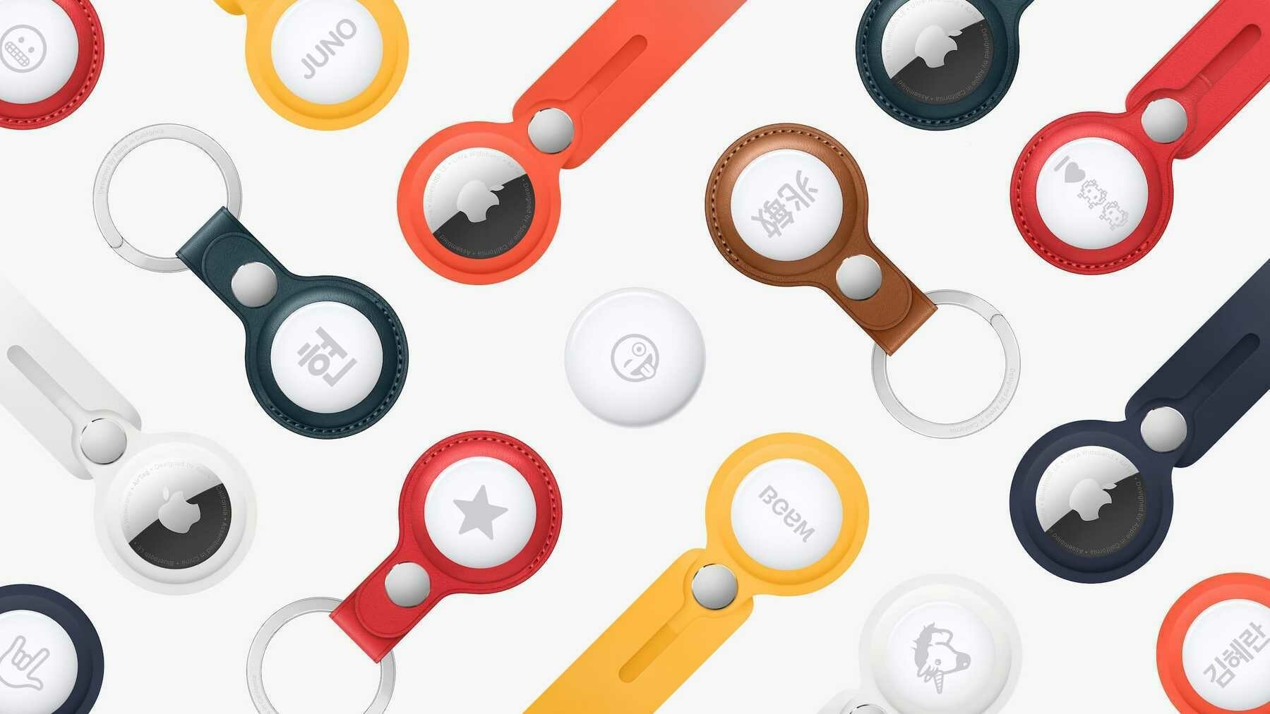
The oft-rumored product is finally here! I’m happy this one didn’t turn into another AirPower type of fiasco.
I don’t know if I’ll ever have a use for these—I tend not to lose things very often—but there are a few people in my life who could benefit from them.
At just over one and a quarter inches in diameter and weighing in at measly 11 grams, they’re quite discreet. They’re not the sort of thing to add extra bulk to your key ring or bump around in your bag. They’re so small that it’s a good thing they’re full of helpful tracking technology. These AirTags themselves could be pretty easy to lose!
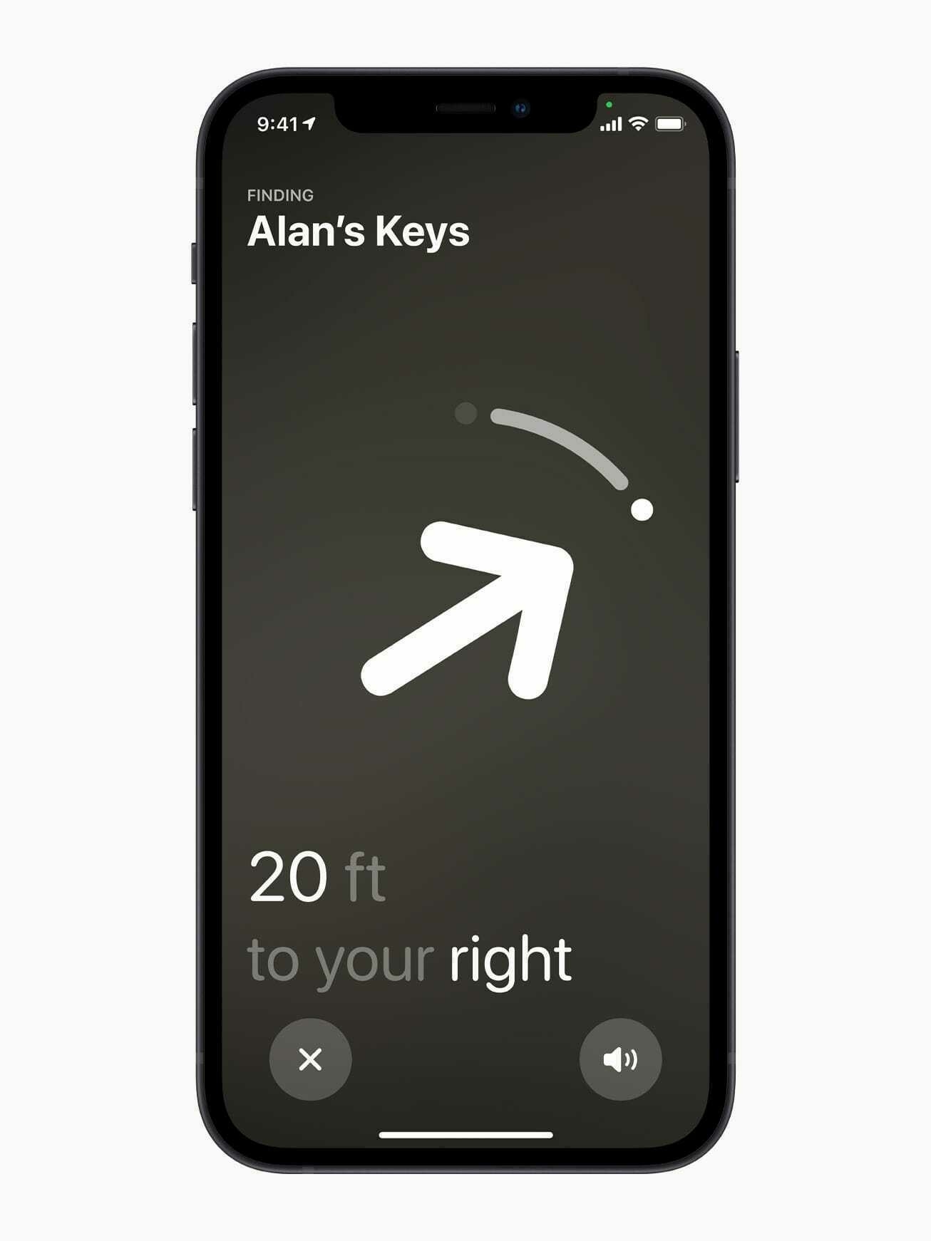
They were designed from the beginning to work with the Find My app. This means you’ll be able to locate them on a map whenever you open the app. They also come with a small speaker which can emit a signal noise to guide you to them. Got an iPhone 11 or 12? Then you can use the Precision Finding feature to give you an on-screen guide to where your lost item is hiding. This is a great implementation of the U1 chip that Apple now includes in these devices.
Best of all, everything is designed with privacy in mind, and the battery in AirTags is user-replaceable. A standard coin cell battery will give it new life. They’re $29 for one and $99 for a pack of four.
iii. Apple TV
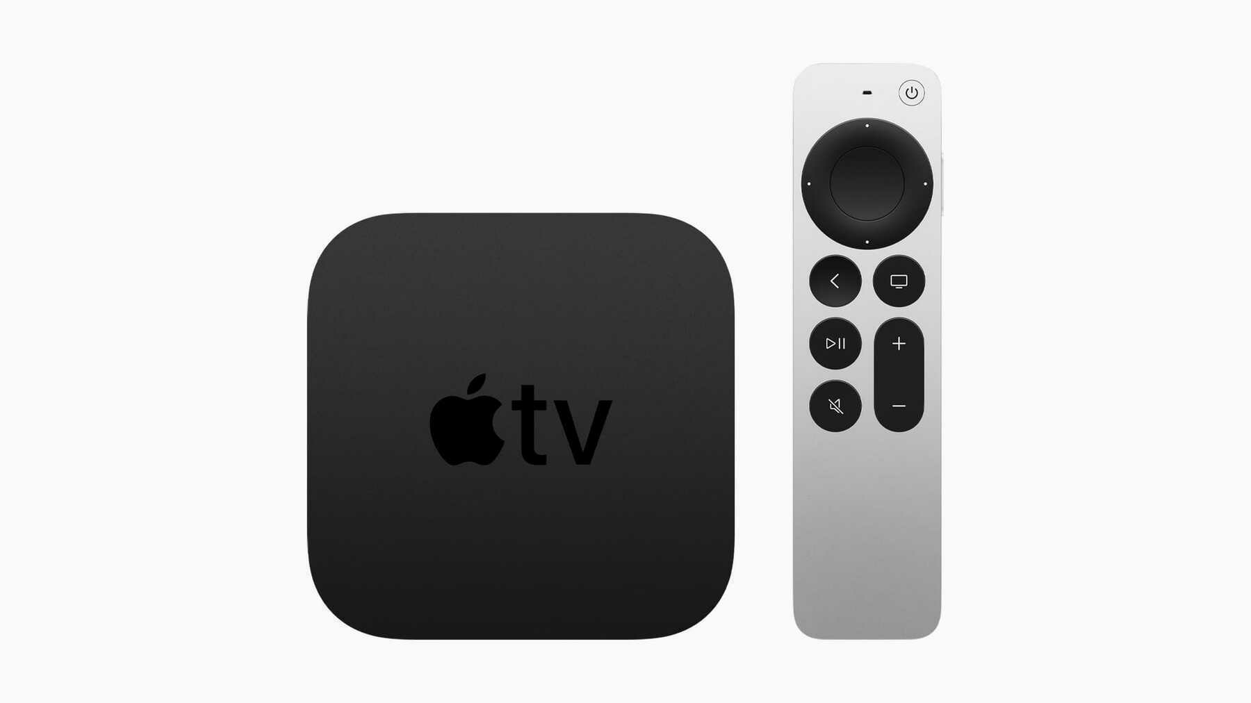
On the one hand, the new Siri Remote looks to be a great step up from the previous version. It’s a genuinely good iteration, and I’m going to be getting one when they become available.
On the other hand, the updated Apple TV 4K box still comes in two storage sizes—32 GB and 64 GB— and it is still expensive as hell—$179 and $199, respectively. And there was sadly no mention of any Apple TV sound bar.
When it comes to this product line, I don’t get what Apple’s thinking. Price-wise, they’re being outmatched by nearly every other device on the market. Heck, every modern tv sold these days has all of these streaming apps available for download, even Apple’s TV app. Why buy a second box that can do everything a tv can now?
At these prices, it’s getting harder for even me to find a reason to stick with Apple on this one. You can be certain that anyone who doesn’t care as much as I do about an Apple experience sure as hell won’t be dropping upwards of $200 on one.
Apple continues to be moving blindly in this market. Unfortunately, they’ve also started shooting themselves in the foot with the Apple TV.
iv. iMac
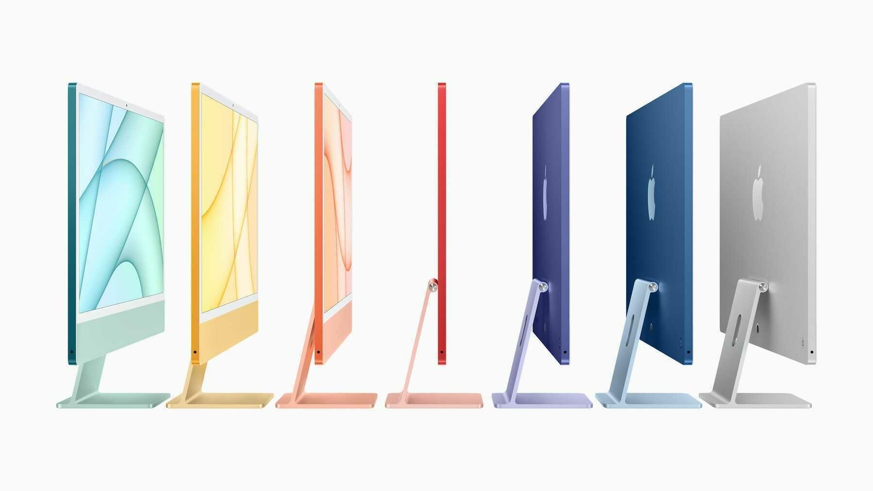
The M1 line continues to grow with this striking and colorful update to what is surely Apple’s most popular desktop computer.
It carries the ghost of the previous generation’s design but differentiates itself in enough ways to make it a desirable machine for anyone who wants a great Mac desktop experience. It’s a shame that there’s still a chin at the bottom of the display, but I guess we can’t have everything.
On the plus side:
I’ve got an M1 Mac mini and display combination that I adore. However, if I were in the market for a new desktop computer, I wouldn’t think twice about purchasing one of these in whatever new color strikes my fancy.
They start at an affordable $1,299.
v. iPad Pro
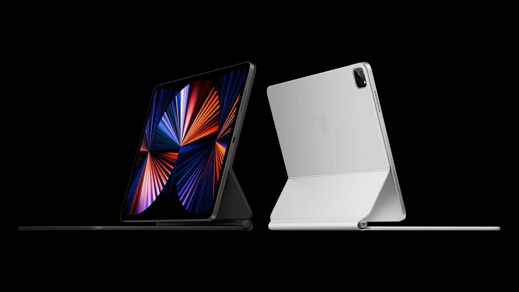
The M1 line continues to grow with this phenomenal update to the iPad Pro.
I’m feeling a distinct sense of déjà vu here…
Ah yes, the most powerful iPad around becomes even more impressive now that it’s running a desktop-class chip inside. I’m a little surprised Apple would move in this direction with the iPad Pro. In the past, they’ve liked to have a distinguishing factor between their different product lines. I guess when you’re making your own CPU chips you have the opportunity to throw the rule book out the window.
This begs the question, though: when are pro-level apps going to come to the iPad Pro? If it’s using the same chip that can easily run Final Cut Pro and Logic Pro on their other computers, then there’s no good excuse why their pro tablets can’t do the same. My best guess is, as usual with these devices, it’s a software limitation. For a long time now, iPad’s software has been lagging hard behind its hardware.
It’s time for iPadOS to step up and become the powerful and capable operating system it’s always wanted to be. I’ve got big hopes for this year’s WWDC. There’s an opportunity for Apple to right a lot of wrongs with this device, and they need to nail it this year.
There’s also a new and crazy good display in the 12.9” model. I’m talking Pro Display XDR level good, and all within the .25” depth of this tablet. Thanks to a remarkable array of over 10,000 mini-LEDs, this thing is going to be awe-inspiring. If you’re a professional filmmaker or photographer, this could be a great update for you.1
Also:
If you’ve gotten an iPad Pro since the gobsmackingly good 2018 model came out, then this may still be a relatively minor update. If you’ve got the money to burn, then go ahead and get one. Who am I to tell you what to do with your bucks? I’m happy to keep my 12.9” iPad Pro from 2020. It’s still amazing.
These new models are pretty damn snazzy though. They start at $799 for the 11” and $1,099 for the 12.9”.
vi.
This was an excellent event for Apple. They dropped some products that are not only appealing at the moment but will help dictate where the company is heading.
AirTags show that they’re interested in continuing to develop a wide range of products that fit a smaller niche. Not everything has to be the freaking iPhone.
The new iMac proves that Apple’s still got a sense of whimsy, while also telling the world that they’re going to continue being the most enviable computer maker around.
The iPad Pro update shows that there’s not another tablet maker out there creating more powerful tools than these. They continue to make advancements that are the envy of the entire tablet market.
The Apple TV… Well, it needs to find itself. That thing is lost in the weeds.
If they can keep this trajectory going, then 2021 is going to be a great year for Apple. 🍎
Ahead of Apple antitrust hearing, Sen. Klobuchar calls AirTag launch ‘timely’ ↗
This just in: monopolist in the item tracking industry is pitching a fit now that their kingly status is being threatened.
Look, go after Apple, et al. There are some legitimate concerns there. AirTags are not one of them. Tile knew this day was going to come and proceeded to do not a damn thing to make their product more desirable than Apple’s. Furthermore, the Find My app is now open for Apple’s competitors to use.
While you’re at it, Congress people, take a look at the real anti-competitive offenders: the telecoms and internet service providers.
What Are the Most Pleasant Streaming Video Player Interfaces?
I’m reminded of Craig Mod’s excellent essay, Fast Software, the Best Software, when I consider the current state of streaming video player interfaces. In the essay, he says that it’s not innovative features or a flashy UI that makes a piece of software the best. Instead, the mark of good software is in how well it performs, or rather, how fast it feels. Software that takes ages to load, bogs down when dealing with a hefty project, or otherwise feels as if you’re trying to work while submerged in a vat of molasses is not the best. I would add to Craig’s thesis that easy to parse and manipulate software also makes for the best software.
Similarly, the various interfaces through which we control our streaming video each have their own speed and feel. Some are so well-designed that using them feels like the screen in front of you is an extension of your body. Others are so damn awful that using them maybe makes you harbor thoughts of flinging your tablet or phone like a Frisbee through an open window.
It’s not luck that turns any of them into a joyful experience. It’s iteration and thoughtful consideration. The poor ones feel slapdash, and appear to be made by people who never actually use the product on which they’re working.
I haven’t used all of them because there are just so many available to us now, but I’ve used several. They all stand out in their own way: some are great, others just get the job done, and a merciful few are loathsome. This is a subjective ranking from worst to best. All images are taken from the iPad versions of these services.
Criterion Channel
I love The Criterion Collection and their Criterion Channel is a treasure trove of artistry and delight. To be involved with their work in any way would be a dream. Perhaps my job could be improving their player interface because their current offering is a pile of hot garbage.

The major problem with this app is hitting play on a video doesn’t bring it to the fore in glorious full screen. Instead, it starts playing in the description window for the film. Giving yourself the full-screen experience requires additional button presses to get there.

This isn’t unique behavior—YouTube works the same way. However, YouTube doesn’t default to a full-screen player because YouTube is also a social network. It features comments made on videos, additional content to watch, and a description for what you’re watching. Criterion Channel is not a social network. It’s a tightly curated collection of some of the best that cinema has to offer, and there’s nothing but friction involved with it.
Every element feels small and cramped. Good luck hitting pause when the skip buttons are only a few short pixels away from it. Criterion Channel appears to embrace the current “small is hip” trend. There’s nothing wrong with large buttons; they actually make things faster and more enjoyable to use. With these issues, I find myself not wanting to even open the app. It’s a damn shame.
Rating: 2/10
Prime Video
Much like any interface design Amazon tries its hand at, this one just feels clunky and careless. It looks like Amazon’s trying their best, but when stacked up next to something prettier, like Hulu or Discovery+, Prime Video just can’t compete.

What it lacks in pleasantness, Prime Video makes up for in information density. It can surface and display actors who are currently onscreen, trivia about what’s being viewed, and music that’s being played. This is due in large part to IMDb being an Amazon-owned company. For movie and tv lovers, it’s a treat.
When you dig deeper into the interface, and the service as a whole, it becomes clear that something is a little off. The whole thing feels like it’s being held together by duct tape and chewing gum. It’s the little things like icon alignment that shouldn’t be an issue but are. For example, the small icons in the upper-right corner of the player window aren’t vertically aligned and it’s all I can see now:
This sort of thing shouldn’t happen when a corporation as large as Amazon is making the app. Yet, this sort of laziness appears to be okay with them.
Rating: 4/10
Paramount+
It’s a damn shame that the massive shortcomings of this service overshadows the niceness of this interface. Seriously, what the heck is going on with Paramount+? Aside from a logo change, it’s currently the exact same thing as its predecessor, CBS All Access, and that wasn’t a great service either.
Here’s what the player looks like:

It’s very nice. Here’s a fine example of an economy of information. We know what’s being played, we can play/pause and skip around with ease, and there’s a couple of extras in the top right. This may be the most spartan interface on this list, and I’m down for it. It makes the whole mess of Paramount+ a little easier to stomach.
Seriously, though, what’s wrong with that service? Why doesn’t it have anything resembling a watchlist? Why did they think a logo change and a SpongeBob movie was enough to shake the streaming world? Maybe there’s a mountain of entertainment, but the way to the peak is filled with disappointment.
Still, the player interface is nice and quick.
Rating: 5/10
Discovery+
Discovery+’s interface comes so close to greatness. It flirts with being one of the best of the bunch, but it falls down in a way similar to Criterion Channel. On the one hand, we’ve got some clear, well-defined buttons throughout this interface. There are no hard or sharp edges. Indeed, it feels welcoming.

On the other hand, the play/pause and skip buttons in the center of the screen are positioned so close together that pressing the correct one becomes a challenge. They’re too small and too close. It’s a real letdown.
As a content player, it’s snappy enough. It’s not going to feel too sluggish at any point. The app’s reliance on slow screen animations, e.g., going from a window to a full-screen view, slows things down a touch, but not enough to be frustrating. This is a middle of the road player, and that’s fine.
Curiously, this is also one of the only streaming services that currently doesn’t blank out its content when you take a screenshot. I guess they’re not too worried about piracy.
Rating: 6/10
Peacock
Admittedly, Peacock is the service I’ve used the least. I only signed up for a trial when it premiered because I wanted to watch Psych 2: Lassie Come Home. I’m not that big of a fan of The Office, so I didn’t have any interest in paying for or using the service.
That being said, here’s the interface:

In terms of its speed, it feels adequate. This may have been because it needed to serve me an ad before playing a video, so getting itself going was a small endeavor. Once my chosen video finally started playing, there wasn’t anything about its speed to complain about. Perhaps this wouldn’t be an issue on their ad-free tier?
The buttons throughout the interface are well-designed and well-spaced. It’s all comfortable to use, and nearly everything is clear. My only gripe is with the row of three buttons in the lower-right corner. At first glance, it’s not evident what those buttons are supposed to represent. There’s no accompanying text, so there’s some trial and error involved. If you’ve used many other streaming services, then they may be familiar, but that’s not a sure bet. It could be clearer and more accessible.
Rating: 6/10
HBO Max
You could place the interfaces of HBO Max and Disney+ side-by-side and they’d both come out as equal winners. The minimal nature of the interface is a big part of why this interface looks so good:

This interface appears to have been designed by someone who doesn’t want to have to squint at their screen. All of its buttons are sized and placed well. The play/pause and skip buttons in the middle are the sort you could probably press accurately with your eyes closed. Heck, even the numbers in the progress bar at the bottom are easy to see.
However, the app’s reliance on slow-moving animations to transition between screens and when starting a video is terrible. It slows down what would otherwise be a fast piece of software. Screens push each other over on every button press, but only after a pause of a second or two, as if the app needs time to think. Getting a video playing is also an exercise in patience, and I have decent internet. The sluggishness of the HBO Max app makes the experience of using it less pleasant; it could have been a real contender.
Rating: 6/10
YouTube TV
I really wish that YouTube TV, Google’s live and on demand tv service, would take more inspiration from its internet video cousin. They’re similar, but not enough in the ways that matter.

With YouTube TV, we’ve got an interface with small, close-packed buttons right in the middle of the action. I wouldn’t mind the multitude of control buttons if they were just spaced further apart. This is especially egregious on a device like an iPad, where the substantial screen real estate goes sadly unused.
The service is quick enough, and that saves it from a world of hurt. You’re not going to find yourself waiting around for screens to animate in or content to start playing. The app feels as present as regular YouTube. Were it anything else, YouTube TV would be closer to the bottom of this list.
Rating: 6/10
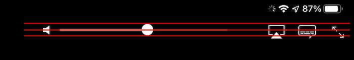
Apple
Apple’s player window feels omnipresent, and indeed may be the inspiration for many current video players. This is an interface that millions of people are familiar with on an intimate level. Most video you play on an iPhone or iPad is going to be controlled with this interface:

It’s basic, and includes everything a person needs to view and control video on a screen. Notably, it’s one of the few in this list of players that doesn’t obscure any video in the center of the screen with its play/pause or skip buttons, which bucks the current trend. Not only is Apple’s version unique, in this case it also makes hitting those controls less reliable. Compared to HBO Max or Netflix, it’s all too easy to skip around a video instead of pausing it, or vice versa. I don’t have sausage fingers, but I still find the controls a bit too small. Having to be precise in my tapping slows me down. Slow software is not the best software.
Rating: 7/10
Hulu
No other service in this list resembles Apple’s player interface as much as Hulu’s does. I think that’s to its credit. We’re in familiar territory with this one:

Hey, if it works for Apple, then why shouldn’t it work for Hulu? This is a curious design, though, considering Disney owns Hulu. I would have expected it to resemble Disney+, or vice versa, in the name of corporate uniformity. Clearly, there are different teams working on these services, and they may want to avoid confusion between the two.
We’ve got a service and a player interface that feels acceptable, and that’s where it stops. It falls prey to the same drawbacks that Apple’s player does. Sticking the play/pause and skip buttons in the lower-left corner makes for a tough time when trying to press the correct button. On the other hand, it’s as speedy as Disney+, and that’s a good thing. You’re not going to feel held back.
Rating: 7/10
Disney+
Now we’re talking. Considering the money that was spent to ensure that the launch of Disney+ was a success, it’s no wonder that its player interface is a minimalist marvel (no pun intended).

What Disney has chosen to give you feels refreshing. You have only what you need, and that’s more than enough. It’s clear what every button does, and mercifully, the play/pause and skip buttons are large and given a pleasant amount of breathing room. There’s not going to be any accidental button presses here.
This entire service feels refined and snappy. Selecting a video to watch brings up the player instantly, with only a quick wipe animation to sit through. They probably figure there’s no time to wait when young children want to watch their shows. What do they care about flashy animations? This is a pleasure to use.
Rating: 8/10
Netflix
Netflix is the gold standard of player interfaces. This isn’t a surprise considering how long they’ve been in the game. Heck, when it comes to streaming content, they were among the first to make online video easy to watch.

However, their lead is becoming tenuous. There’s strong competition coming from the likes of Disney+, and that’s not going to stop. Disney is signing people up for their service at lightning speed.
Browsing through Netflix and starting a video feels smooth and quick. There’s nothing to slow you down when you get a good steam going. They don’t subject you to animations that serve no purpose. It just plays your content when you tell it to. Many other streaming services on this list should take note.
My only concern with Netflix’s interface is it’s beginning to feel heavy. There are many buttons available, and most of them are crammed down at the bottom. Were this player interface to resemble Disney+ more, then it may have earned a perfect score. On the plus side, everything is easy to see and press. It continues to be joyful.
Rating: 9/10
We’ve never had more or better streaming services available to us, and that’s a wonderful thing. It’s nice to have such an assortment of good content waiting for us at any time.
The player interfaces of these various services shows that there’s always room for improvement. In some cases, there’s a desperate need for improvement.
Instead of spending so much of their considerable resources on trying to acquire more content than their competitors, these companies should apply time and effort1 toward making the prettiest and quickest interface imaginable. Admittedly, that’s a tough sell for an aspect of the service that should be mostly invisible. However, an interface that isn’t good-looking or fast is not going to be invisible. It’s going to be screamingly obvious and bad.
Friction drives people away. Ease invites people in.
AirPods Max Are My Best Audio Buddies
i.
It’s been a little over two months since I received my AirPods Max, and I’ve used them every single day since getting them. I love them very much, especially so since I used an Apple gift card with a very generous amount placed on it to purchase them.
I won’t bury the lede: do I think you should get AirPods Max for yourself? Probably not. I got extremely lucky with my gift, and I chose to spend that money on something that I thought I would appreciate. Turns out they’re lovely, and I’m grateful for them.
As far as headphones go, they’re both expensive and not expensive at all. Compared to other noise-cancelling headphones in its quality range, e.g., the Sony WH-1000XM4 headphones, they’re overpriced. Heck, even compared to other Apple audio products they’re overpriced. Stack them up next to something like the Audeze LCD-4 headphones, however, and you’ll see what a bargain they can be.
If someone was looking to purchase a great pair of headphones, I’d probably point them in the direction of the ones from Sony.1 Those offer similar functionality and sound for a couple of hundred dollars less than the AirPods Max. To be frank, that’s the better deal.
However, I’ve been enjoying Apple’s offering and think they fit mostly well in Apple’s audio lineup.
ii. The sound of AirPods Max
Ubiquitous “I’m not an audiophile” warning.
Apple’s doing a lot of computational work to make these headphones sound balanced and present. Compared to their Beats line of products, these headphones offer sound that doesn’t assault your ears with heavy bass. Instead, I’m hearing bright high notes, a midrange that makes vocals sound like the person singing is right in front of me, and bass that thumps the inside of my head without making my brain feel like it’s being squished.
Apologies for the use of florid descriptions of the way these sound. At least I didn’t use “sparkly” or “chunky” or “tinny.”
Everything feels accurate to my ear. I’m confident that what I’m hearing is, for the most part, what I should be hearing. It’s all just there. What I’m hearing lives inside my head, directly center stage.
That’s because it’s not just some magnets moving the air between the headphones and my ears, as many headphones are. There’s a computer chip inside each ear cup that processes, tunes, and adjusts what’s being beamed to them from my phone or other devices. The sound it plays is being styled, but not to alter what was created by the artist. Instead, it’s to enhance the experience for the listener.
The noise cancellation is also the best I’ve ever experienced. It’s not on par with Apple’s previous best, the AirPods Pro, because they’re better. Instead of being shoved inside your ear canal it envelops your ear with a soft cushion. I don’t experience any of the pressure that some people can feel when they wear noise-cancelling headphones, and I don’t think that’s an accident. Apple’s figured out how to make a pleasant cancellation experience as invisible as possible.
Likewise, their Transparency Mode, which relies on that same magic, is breathtaking to consider. The headphones aren’t just turning off noise cancellation—you’d then only hear muffled sounds from around you. Instead, they’re using the many microphones in the headphones to “play” outside sounds to you, just as it plays music. Every time I switch over to this mode, by pushing the noise control button, I marvel at how it seems like I’m not actually wearing headphones.
These sound so good that I don’t think I’ll ever consider another pair of headphones.
iii. The feel of AirPods Max
There was a big fuss about the feel of these headphones when they came out. It’s safe to say that everyone’s concerns are, on the whole, not a problem in the slightest. These are the most comfortable headphones I’ve ever owned, and I look forward to putting them on each day.
The only thing anyone should be concerned about is the fabric mesh on the headband. This “canopy,” as Apple calls it, will forever feel vulnerable to the world. I fear the day when I accidentally snag it on something and it screws up the fit and feel of the headphones. This is reason enough to invest in AppleCare+ for them.
Otherwise, they’re outstanding. I can wear them all day without feeling like they’re squishing my head—a common problem with other headphones I’ve owned. The ear cushions feel like pleasant pillows. The telescoping arms extend to the perfect length for my (large-ish) head. Everything comes together to equal comfort.
I’ve not once felt like these are too heavy. They feel perfect in their weight and distribution. Many people complained about their feel and how much they moved around on the head. I don’t know where that’s coming from. I have a pair of Audio-Technica ATH-M50X headphones that I use when recording podcasts. Since getting the Max, I dread having to wear these. They do feel lighter than headphones made primarily of metal, but they also feel like cheap pieces of crap in comparison. They flop around, squeeze my head, and struggle to achieve a decent seal around my ears.
AirPods Max glow with the luxury Apple imbues so many of its products. I feel like I’m wearing something special when I slip these on.
iv. They do fall down in places
There’s some stuff about the AirPods Max that do dampen the enjoyable experience:
v. They’re the best headphones I’ve ever owned
Surely, they’re not the best sounding headphones ever made. Put on a costly pair of wired headphones that are attached to an imposing stack of converters, amplifiers, and equalizers and you’d no doubt have a transcendent experience that the AirPods Max will never be able to meet. That also sounds like a cumbersome undertaking, and a damn expensive one.
There’s not really a price ceiling when it comes to audio equipment. Audio gear is a money monster. It will consume whatever cash you throw at it, and it’ll do it with a greedy smile on its face.
You can find headphones that’ll run you the price of a brand-new car. You can get a digital-to-analog converter (or DAC) that’s five times the price of the AirPods Max. A quick internet search will give you listings of floor speakers that can cost as much as an enormous house.
The only limit on this stuff is how much your wallet is capable of handling.
I don’t want any of that nonsense. If that’s your thing, then more power to you, but it’s not mine. I value a frictionless experience that can delight my ears. I don’t want to be tethered to an amp because I’m wearing headphones that won’t even function without wired power. Instead, I want to be able to connect to multiple devices with ease, move freely around my home, and play whatever I want whenever I want.
AirPods Max have given me all of that, and I couldn’t be more happy to own them. If I had the money, I would buy them a second time (probably for my wife), even if I wouldn’t necessarily say other people should get them. If you’ve got the expendable cash, then go for it, but again, they’re so damn expensive. They’re still one of my favorite Apple products ever. They consistently amaze me and have been a great companion as I’ve written these words. I’m a fan for life.
Twitter introducing Clubhouse features happened a lot sooner than I anticipated.
As Jean-Baptiste Alphonse Karr said, “the more things change, the more they stay the same."1
The Tracking Pixels Are Coming from Inside the Emails!
It’s become damn hard to find services online that respect both its direct and indirect users.
We all know about the well-documented practitioners of invading your personal privacy—Facebook, Google, and the like. Their actions are so blatant and widespread that it’s almost become commonplace.1 They’re not going to start respecting their users until, probably, a collection of large world governments forces them to do so.
It’s a massive hurdle, and one that should be leapt over sooner rather than later.
What feels like a more manageable feat at this time is turning our attention toward smaller entities. I’m thinking of email marketing services. There’s no shortage of options available to someone who wants to blast out an email to one person or a million people. You’re likely familiar with Mailchimp, Campaign Monitor, Constant Contact, and ConvertKit. That’s just a small drop in the email marketing bucket; there are many other options to choose from.
What’s remarkable about all of them is the sneaky way they turn the use of invasive tracking pixels into a feature. Tracking pixels, spy pixels, tracking images, or whatever you want to call them are bits of code placed inside an email. They tend to be small images created by that code, usually the size of a single pixel, that run when a recipient opens a message and loads the content within. They can track numerous aspects of the email you just received:
All of them offer this ability, and they all describe this feature with jazzy language about its immense benefits. From Mailchimp:
You can easily find out who has interacted with your marketing, and whether they’ve clicked, bought, or downloaded, so you can create more content that resonates with them.
From Campaign Monitor:
Campaign Monitor drives you through the [actionable insights] process with a complete set of reports, giving you the data you need to revise your strategy and exceed your goals.
From ConvertKit:
Understanding how your audience interacts with your emails helps you make better decisions in the future.
What all that boils down to is “we’ve placed invisible code into your email that runs whenever your recipients open them, and all without your or their express consent, because marketing!”
At this point, I should mention that there is at least one email list service that offers the option, and now enables it by default, to turn off its tracking pixels. Buttondown is a service created and “run by a human” named Justin Duke. I’ve enjoyed using it for a while now, and I’ll probably stick with until the end of my days.
I’ve used ConvertKit in the past for Dandy Cat’s email list service. It’s okay. They’re all just… okay. About a year ago, after learning what these tracking pixels are and what they can do, I asked them if it was possible to turn off their pixels. Their official support message was a friendly, but unsurprising “we’re perfectly fine with how our tracking pixels work and will continue making this a feature of our service.”
None of these larger companies have any interest in changing this default behavior, or even giving users an option to turn it off. Why would they? This analytics information is their bread and butter, which is why they’ll never stop using them if they can help it.
In a Daring Fireball post made on September 3, 2020, John Gruber writes:
Just because there is now a multi-billion-dollar industry based on the abject betrayal of our privacy doesn’t mean the sociopaths who built it have any right whatsoever to continue getting away with it. They talk in circles but their argument boils down to entitlement: they think our privacy is theirs for the taking because they’ve been getting away with taking it without our knowledge, and it is valuable.
This was written specifically about ad industries balking at Apple’s use of permission dialogs informing their users that apps may be tracking them. However, I think it also applies perfectly in the case of email marketing services. There’s money to be made from the tracking of their emails, so why wouldn’t they try to grab as much as they can? Nobody’s stopping them. Heck, most people don’t even know they’re doing this!2
They package these tracking features with a neat, clandestine bow and reap the rewards. They sell them as a sorely needed benefit to their users, but it’s really an insidious method of making money. Not only that, but they can get away with it because they include language in their respective privacy policies stating that they collect this information. That in itself is frustrating—“we’re allowed to collect personal and sensitive information about you because we tell you that we’re collecting this information.” Talking in circles is right. You can see this in action in Mailchimp’s privacy policy. Marvel at how dense and filled with legal-ese that thing is.
I can guarantee you that if this technology gets taken from them—the email marketing services, the ad agencies, the social networks—they will collectively cry foul. They would insist that their earning potential, hell, their entire existence, would be in jeopardy because they’re not able to sell our stolen personal information. In fact, Mark Zuckerberg was one of those people that balked at Apple’s decision to implement those tracking permission dialogs in their software. Business Insider reports:
Facebook CEO Mark Zuckerberg took aim at Apple on Thursday over its plans to limit advertisers’ ability to track iPhone users, suggesting the proposed changes could hurt small businesses and, by extension, the broader economy.
During Facebook’s quarterly earnings call, Zuckerberg told investors that “actions planned by platform companies like Apple could have a meaningful negative effect on small businesses and economic recovery in 2021 and beyond.”
I feel we can agree that Zuckerberg’s motivations in this matter are less about the health of small businesses and much more about obscuring Facebook’s boundless tracking of its users. Tracking that has a significant influence on Facebook’s bottom line.
Our private information is currently theirs for the taking, and they sell it off to advertising agencies who use it to display personalized ads on the websites and apps we visit. It’s often said that if you’re not paying for a product, then you are the product. The way the internet has evolved, this saying should be amended to be “if you’re online in any way, then you’re the product.”
It’s all bullshit, none of it should be allowed, and our personal information should be respected far more than it is. I don’t see that happening without powerful intervention, much in the way that GDPR was created intending to protecting citizens of the European Union and the European Economic Area. If that’s what it takes, then I welcome it. Our personal information should be ours alone.
I’ve just spent a good hour and a half cleaning up my website’s CSS (but I still have a long way to go with that endeavor). I also removed a sneaky bit of HTML font code in my site’s theme that was communicating with Google Analytics. Now it’s all tracker free!
Time for bed. 😴
After using ConvertKit for way too long, I’ve switched over to Buttondown and I feel great about it. Is it perfect? Nope, but at least I can opt-out of including insidious tracking pixels in all of the emails I send out. ConvertKit all but told me they’ll never give that option.
What’s the estimate on when Facebook, Twitter, and the like (those that tend now to follow the pack instead of paving the way) implement obviously Clubhouse-type features? What’s a good unit of measurement in this case? Three “Instagram Stories” from now?
I just spent the last couple hours restoring my M1 Mac Mini because of a consistent kernel panic issue. I think it may have solved the issue and brought back my great computer. At least, I hope so because that was a lot of work.
My M1 Mac Mini is a truly wonderful machine. I love every part of it, except for the near daily kernel panics that occur when it goes to sleep. It only ever seems to happen once a day, but it’s still enough to be worrisome and frustrating.
Micro.blog hasn’t produced any frustration. Its customization challenges are more like fun puzzles. I left Micro.blog to save some money, but Ghost ended up costing more, in many ways. I’m looking forward to building something more fun here.
Okay, website service update over.
My return to Micro.blog stems from my frustration with Ghost. Like most website creation services, it’s great if you don’t want to do much beyond the basics. I wanted to do more, but didn’t understand their code (which is my own failing). It produced headaches for me.
I recently purchased a product from Schiit (a previous generation Magni device). It shipped without stick-on rubber feet. After writing them an email, they’re going to be sending me some for free. The postage probably costs more than the feet. Talk about great customer support.