What Are the Most Pleasant Streaming Video Player Interfaces?
I’m reminded of Craig Mod’s excellent essay, Fast Software, the Best Software, when I consider the current state of streaming video player interfaces. In the essay, he says that it’s not innovative features or a flashy UI that makes a piece of software the best. Instead, the mark of good software is in how well it performs, or rather, how fast it feels. Software that takes ages to load, bogs down when dealing with a hefty project, or otherwise feels as if you’re trying to work while submerged in a vat of molasses is not the best. I would add to Craig’s thesis that easy to parse and manipulate software also makes for the best software.
Similarly, the various interfaces through which we control our streaming video each have their own speed and feel. Some are so well-designed that using them feels like the screen in front of you is an extension of your body. Others are so damn awful that using them maybe makes you harbor thoughts of flinging your tablet or phone like a Frisbee through an open window.
It’s not luck that turns any of them into a joyful experience. It’s iteration and thoughtful consideration. The poor ones feel slapdash, and appear to be made by people who never actually use the product on which they’re working.
I haven’t used all of them because there are just so many available to us now, but I’ve used several. They all stand out in their own way: some are great, others just get the job done, and a merciful few are loathsome. This is a subjective ranking from worst to best. All images are taken from the iPad versions of these services.
Criterion Channel
I love The Criterion Collection and their Criterion Channel is a treasure trove of artistry and delight. To be involved with their work in any way would be a dream. Perhaps my job could be improving their player interface because their current offering is a pile of hot garbage.

The major problem with this app is hitting play on a video doesn’t bring it to the fore in glorious full screen. Instead, it starts playing in the description window for the film. Giving yourself the full-screen experience requires additional button presses to get there.
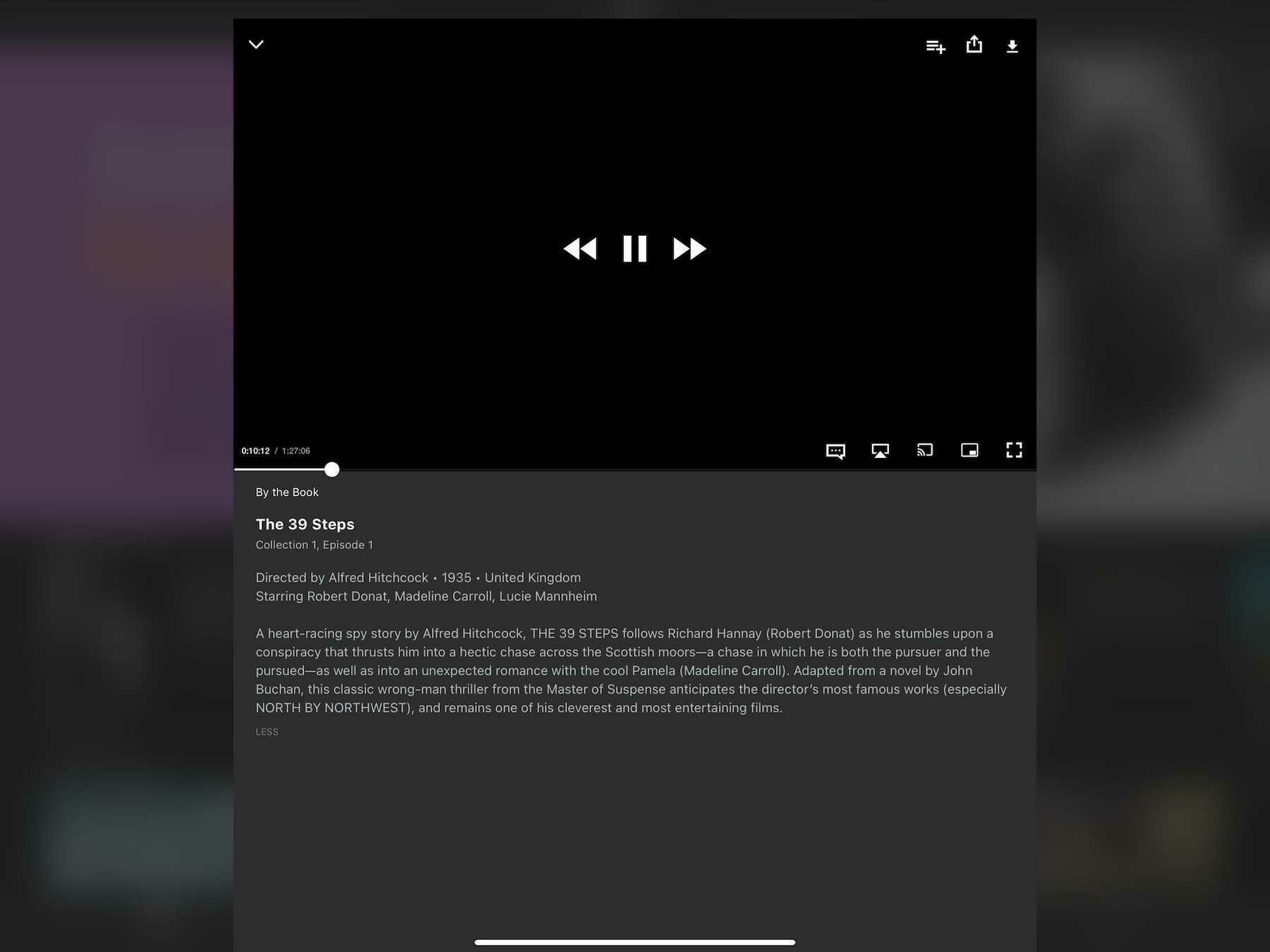
This isn’t unique behavior—YouTube works the same way. However, YouTube doesn’t default to a full-screen player because YouTube is also a social network. It features comments made on videos, additional content to watch, and a description for what you’re watching. Criterion Channel is not a social network. It’s a tightly curated collection of some of the best that cinema has to offer, and there’s nothing but friction involved with it.
Every element feels small and cramped. Good luck hitting pause when the skip buttons are only a few short pixels away from it. Criterion Channel appears to embrace the current “small is hip” trend. There’s nothing wrong with large buttons; they actually make things faster and more enjoyable to use. With these issues, I find myself not wanting to even open the app. It’s a damn shame.
Rating: 2/10
Prime Video
Much like any interface design Amazon tries its hand at, this one just feels clunky and careless. It looks like Amazon’s trying their best, but when stacked up next to something prettier, like Hulu or Discovery+, Prime Video just can’t compete.

What it lacks in pleasantness, Prime Video makes up for in information density. It can surface and display actors who are currently onscreen, trivia about what’s being viewed, and music that’s being played. This is due in large part to IMDb being an Amazon-owned company. For movie and tv lovers, it’s a treat.
When you dig deeper into the interface, and the service as a whole, it becomes clear that something is a little off. The whole thing feels like it’s being held together by duct tape and chewing gum. It’s the little things like icon alignment that shouldn’t be an issue but are. For example, the small icons in the upper-right corner of the player window aren’t vertically aligned and it’s all I can see now:
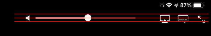
This sort of thing shouldn’t happen when a corporation as large as Amazon is making the app. Yet, this sort of laziness appears to be okay with them.
Rating: 4/10
Paramount+
It’s a damn shame that the massive shortcomings of this service overshadows the niceness of this interface. Seriously, what the heck is going on with Paramount+? Aside from a logo change, it’s currently the exact same thing as its predecessor, CBS All Access, and that wasn’t a great service either.
Here’s what the player looks like:
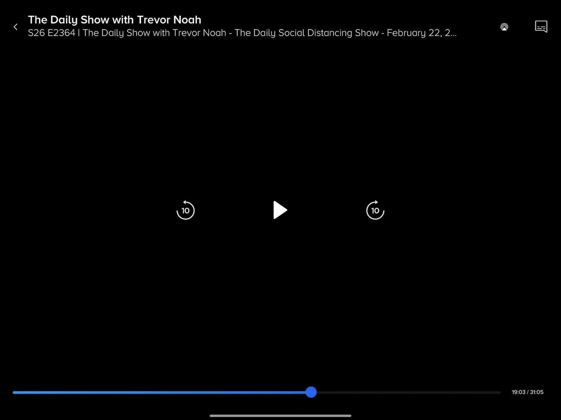
It’s very nice. Here’s a fine example of an economy of information. We know what’s being played, we can play/pause and skip around with ease, and there’s a couple of extras in the top right. This may be the most spartan interface on this list, and I’m down for it. It makes the whole mess of Paramount+ a little easier to stomach.
Seriously, though, what’s wrong with that service? Why doesn’t it have anything resembling a watchlist? Why did they think a logo change and a SpongeBob movie was enough to shake the streaming world? Maybe there’s a mountain of entertainment, but the way to the peak is filled with disappointment.
Still, the player interface is nice and quick.
Rating: 5/10
Discovery+
Discovery+’s interface comes so close to greatness. It flirts with being one of the best of the bunch, but it falls down in a way similar to Criterion Channel. On the one hand, we’ve got some clear, well-defined buttons throughout this interface. There are no hard or sharp edges. Indeed, it feels welcoming.

On the other hand, the play/pause and skip buttons in the center of the screen are positioned so close together that pressing the correct one becomes a challenge. They’re too small and too close. It’s a real letdown.
As a content player, it’s snappy enough. It’s not going to feel too sluggish at any point. The app’s reliance on slow screen animations, e.g., going from a window to a full-screen view, slows things down a touch, but not enough to be frustrating. This is a middle of the road player, and that’s fine.
Curiously, this is also one of the only streaming services that currently doesn’t blank out its content when you take a screenshot. I guess they’re not too worried about piracy.
Rating: 6/10
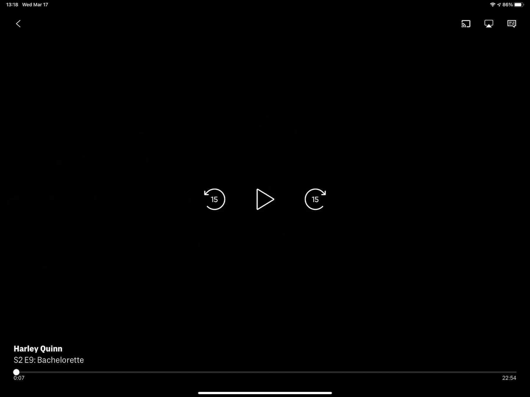
Peacock
Admittedly, Peacock is the service I’ve used the least. I only signed up for a trial when it premiered because I wanted to watch Psych 2: Lassie Come Home. I’m not that big of a fan of The Office, so I didn’t have any interest in paying for or using the service.
That being said, here’s the interface:

In terms of its speed, it feels adequate. This may have been because it needed to serve me an ad before playing a video, so getting itself going was a small endeavor. Once my chosen video finally started playing, there wasn’t anything about its speed to complain about. Perhaps this wouldn’t be an issue on their ad-free tier?
The buttons throughout the interface are well-designed and well-spaced. It’s all comfortable to use, and nearly everything is clear. My only gripe is with the row of three buttons in the lower-right corner. At first glance, it’s not evident what those buttons are supposed to represent. There’s no accompanying text, so there’s some trial and error involved. If you’ve used many other streaming services, then they may be familiar, but that’s not a sure bet. It could be clearer and more accessible.
Rating: 6/10
HBO Max
You could place the interfaces of HBO Max and Disney+ side-by-side and they’d both come out as equal winners. The minimal nature of the interface is a big part of why this interface looks so good:
This interface appears to have been designed by someone who doesn’t want to have to squint at their screen. All of its buttons are sized and placed well. The play/pause and skip buttons in the middle are the sort you could probably press accurately with your eyes closed. Heck, even the numbers in the progress bar at the bottom are easy to see.
However, the app’s reliance on slow-moving animations to transition between screens and when starting a video is terrible. It slows down what would otherwise be a fast piece of software. Screens push each other over on every button press, but only after a pause of a second or two, as if the app needs time to think. Getting a video playing is also an exercise in patience, and I have decent internet. The sluggishness of the HBO Max app makes the experience of using it less pleasant; it could have been a real contender.
Rating: 6/10
YouTube TV
I really wish that YouTube TV, Google’s live and on demand tv service, would take more inspiration from its internet video cousin. They’re similar, but not enough in the ways that matter.

With YouTube TV, we’ve got an interface with small, close-packed buttons right in the middle of the action. I wouldn’t mind the multitude of control buttons if they were just spaced further apart. This is especially egregious on a device like an iPad, where the substantial screen real estate goes sadly unused.
The service is quick enough, and that saves it from a world of hurt. You’re not going to find yourself waiting around for screens to animate in or content to start playing. The app feels as present as regular YouTube. Were it anything else, YouTube TV would be closer to the bottom of this list.
Rating: 6/10
Apple
Apple’s player window feels omnipresent, and indeed may be the inspiration for many current video players. This is an interface that millions of people are familiar with on an intimate level. Most video you play on an iPhone or iPad is going to be controlled with this interface:

It’s basic, and includes everything a person needs to view and control video on a screen. Notably, it’s one of the few in this list of players that doesn’t obscure any video in the center of the screen with its play/pause or skip buttons, which bucks the current trend. Not only is Apple’s version unique, in this case it also makes hitting those controls less reliable. Compared to HBO Max or Netflix, it’s all too easy to skip around a video instead of pausing it, or vice versa. I don’t have sausage fingers, but I still find the controls a bit too small. Having to be precise in my tapping slows me down. Slow software is not the best software.
Rating: 7/10
Hulu
No other service in this list resembles Apple’s player interface as much as Hulu’s does. I think that’s to its credit. We’re in familiar territory with this one:

Hey, if it works for Apple, then why shouldn’t it work for Hulu? This is a curious design, though, considering Disney owns Hulu. I would have expected it to resemble Disney+, or vice versa, in the name of corporate uniformity. Clearly, there are different teams working on these services, and they may want to avoid confusion between the two.
We’ve got a service and a player interface that feels acceptable, and that’s where it stops. It falls prey to the same drawbacks that Apple’s player does. Sticking the play/pause and skip buttons in the lower-left corner makes for a tough time when trying to press the correct button. On the other hand, it’s as speedy as Disney+, and that’s a good thing. You’re not going to feel held back.
Rating: 7/10
Disney+
Now we’re talking. Considering the money that was spent to ensure that the launch of Disney+ was a success, it’s no wonder that its player interface is a minimalist marvel (no pun intended).

What Disney has chosen to give you feels refreshing. You have only what you need, and that’s more than enough. It’s clear what every button does, and mercifully, the play/pause and skip buttons are large and given a pleasant amount of breathing room. There’s not going to be any accidental button presses here.
This entire service feels refined and snappy. Selecting a video to watch brings up the player instantly, with only a quick wipe animation to sit through. They probably figure there’s no time to wait when young children want to watch their shows. What do they care about flashy animations? This is a pleasure to use.
Rating: 8/10
Netflix
Netflix is the gold standard of player interfaces. This isn’t a surprise considering how long they’ve been in the game. Heck, when it comes to streaming content, they were among the first to make online video easy to watch.

However, their lead is becoming tenuous. There’s strong competition coming from the likes of Disney+, and that’s not going to stop. Disney is signing people up for their service at lightning speed.
Browsing through Netflix and starting a video feels smooth and quick. There’s nothing to slow you down when you get a good steam going. They don’t subject you to animations that serve no purpose. It just plays your content when you tell it to. Many other streaming services on this list should take note.
My only concern with Netflix’s interface is it’s beginning to feel heavy. There are many buttons available, and most of them are crammed down at the bottom. Were this player interface to resemble Disney+ more, then it may have earned a perfect score. On the plus side, everything is easy to see and press. It continues to be joyful.
Rating: 9/10
We’ve never had more or better streaming services available to us, and that’s a wonderful thing. It’s nice to have such an assortment of good content waiting for us at any time.
The player interfaces of these various services shows that there’s always room for improvement. In some cases, there’s a desperate need for improvement.
Instead of spending so much of their considerable resources on trying to acquire more content than their competitors, these companies should apply time and effort1 toward making the prettiest and quickest interface imaginable. Admittedly, that’s a tough sell for an aspect of the service that should be mostly invisible. However, an interface that isn’t good-looking or fast is not going to be invisible. It’s going to be screamingly obvious and bad.
Friction drives people away. Ease invites people in.
-
That is to say, money. ↩︎