-
Although, what is there to possibly be embarrassed about? They’re absolutely wonderful performers. ↩︎
-
Although it could rightly be said that Kit rapes Holly, what with him being 25 years old and her being 15. ↩︎
Title Card: How to Steal a Million (1966)
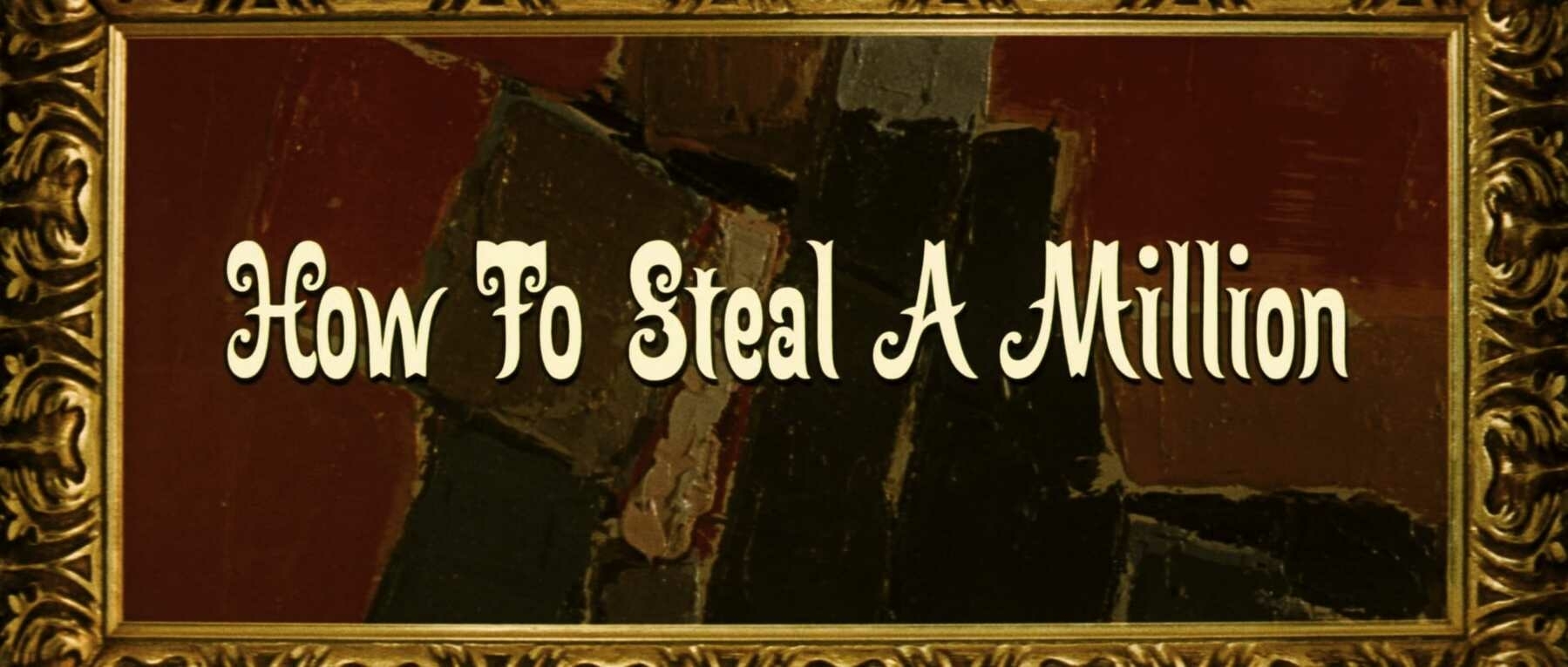
How to Steal a Million was written by Harry Kurnitz and directed by William Wyler. It was released in 1966. It was produced by World Wide Productions and was distributed by Twentieth Century Fox. The main title design was done by Phill Norman.
The film gives us the wonderful pairing of Audrey Hepburn as Nicole Bonnet, the daughter of an art forger, and Peter O’Toole as Simon Dermott, a charming burglar. Nicole’s father is lending a much-lauded Cellini Venus statuette to a local art museum but unknowingly agreed to have this piece inspected for authenticity. Should this happen, his fraud would be found out, ruining his life and work. Following an unsuccessful robbery attempt at Nicole’s home, Simon agrees to help her steal her father’s statue before his livelihood can be put at risk.
I would call myself a pretty unabashed Audrey Hepburn and Peter O’Toole fan,1 but my experience with their films is startling in its meager size. Sure, I’ve seen Charade and Venus, but that’s about as far as it goes. I desperately need to see more of their work. When my wife suggested watching this one, I was intrigued. How could you not be with a title like that? I didn’t know how much fun I would have watching this one. Truly, it was a blast. A nice and breezy caper is sure to please anybody who watches it. Throw this duo of actors together, and it’s impossible not to have magic. This film may be the reason why I end up seeing a lot more of their work, and for that, I’m also grateful for it. 🎞
Title Card: The Fall (2006)
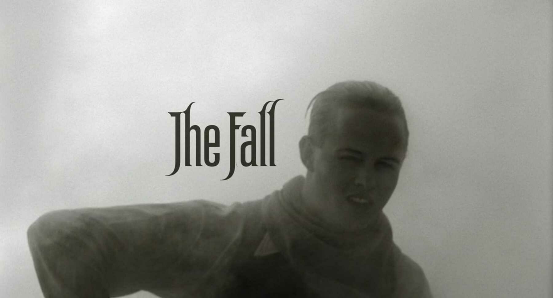
The Fall was written by Dan Gilroy, Nico Soultanakis, and Tarsem Singh, and was directed by Tarsem Singh. It was released in 2006. Radical Media and Absolute Entertainment produced the film, while Roadside Attractions distributed it. The title design was done by Stefan G. Bucher and John R. Waters. The main title typography was done by Stefan G. Bucher and 344 Design.
The film stars Lee Pace as a hospitalized stuntman named Roy Walker, who is bedridden in early 20th century Los Angeles. While in the hospital, he meets a young girl recovering from a broken arm named Alexandria, played by Catinca Untaru. He takes a friendly liking to her and spins her a fantastical tale about five mythical heroes. Her youthful imagination allows us to witness Roy’s story as he tells it. However, Roy is in a bad way, and between tellings of his story, convinces Alexandria to steal morphine pills from the hospital. He wishes to end his life. Thankfully, that doesn’t pan out for Roy, and he’s willed by Alexandria to tell her the full, wonderful story.
This film’s heart, its story, the beauty of its production design, costume design, and cinematography, are all unlike anything that’s ever been set to film. The entire title sequence is itself a masterwork of storytelling and filmmaking. It exists in its own microcosm within the film. In it, we see a large group of locomotive workers attempting to lift a horse out of a river beneath a railroad bridge. It does not appear to have any direct connection to the rest of the story. Instead, it sets a time and place, along with a unique mood. It’s shown in black and white, slow motion, and accompanied by Beethoven’s Symphony No. 7 in A Major, Op. 92: II. Allegretto. Watching it, we understand that we’re entering a world of hardship and backbreaking work. There will be no modern conveniences. No mobile phones or television or internet. It’s a tough world where rescuing a horse from a river requires a band of sweaty, yelling men and a freaking train. Color-wise, it’s quite the contrast with the rest of the film, which is shown in brilliantly saturated hues of many colors. This title sequence is a wonder.
In fact, it’s so remarkable that you must watch it. This title sequence is a compelling short film in its own right. 🎞
Title Card: Badlands (1973)
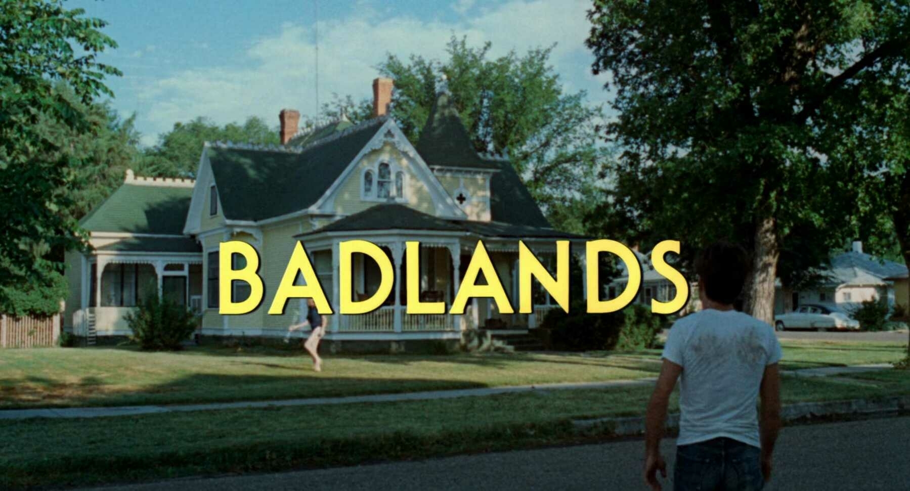
Badlands was written and directed by Terrence Malick and released in 1973. It was released by Warner Bros. The titles were done by Consolidated Film Industries.
The film stars Martin Sheen as Kit and Sissy Spacek as Holly. The pair fall for each other hard and right away.1 Holly’s father disapproves, which leads to his violent death at Kit’s hands. The pair go on the run, leaving a growing trail of dead people behind them as they try to evade capture.
This was not the first Malick film I’ve seen. That distinction would go to The Thin Red Line, but by the time I got to Badlands (which was not long after), I was an avowed and major fan of his. I find this one fascinating because it doesn’t quite feel like his other films, but you can already see sprinklings of several of his trademarks. The calm voice-over throughout (done in this one by Spacek); the introspective reflection on life, spirituality, and our place in the world; and of course, the beautiful cinematography from a trio of artists: Brian Probyn, Tak Fujimoto, and Stevan Larner. It may still be Malick’s most straightforward film, and therefore, his most accessible. It’s not the first film about star-crossed murderers, but it is one of the most captivating. There’s violence in this film, but it’s perpetrated by someone with such charisma that the pair even seduces the officers and National Guard troops that eventually end up catching them. For me, this is far more captivating than movies like Bonnie and Clyde, Thelma & Louise, or Natural Born Killers.
Be sure to enjoy this video from The Criterion Collection which delves into Malick’s use of voice-over throughout his work. Editor Billy Weber, who did uncredited work for Badlands, discusses Malick’s inspirations and history with this filmmaking tool. 🎞
Title Card: The Great Beauty (2013)
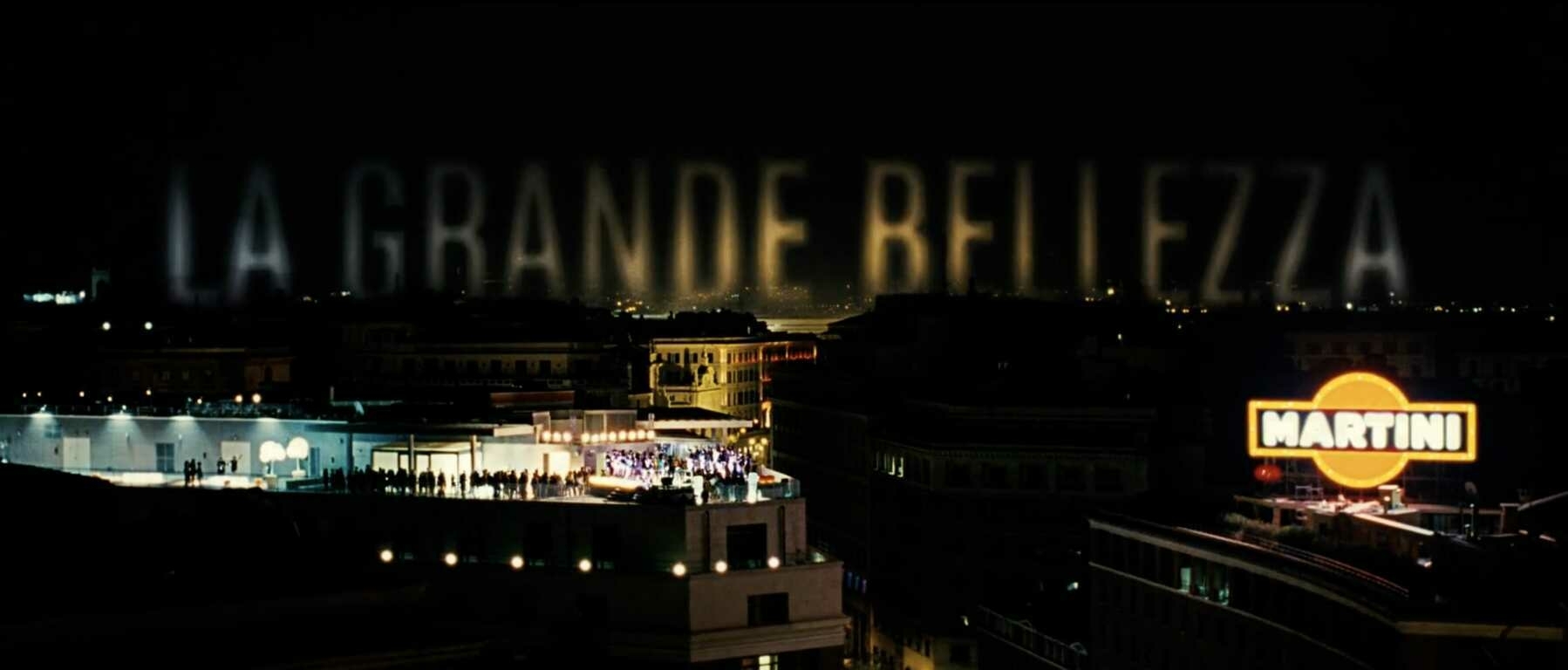
The Great Beauty (or La grande bellezza, as it’s originally known) was directed by Paolo Sorrentino and released in 2013. It was produced by Indigo Film, Medusa Film, Babe Film, Pathé, and France 2 Cinéma. The main titles supervisor was Francesca Di Giamberardino.
The film stars Toni Servillo as theater critic, Jep Gambardella. Turning 65 and learning of the death of his first and greatest love is a complete shock to his system. Now feeling without purpose, he ventures out into Italy, and away from the vapid parties he once frequented as nothing much more than a socialite. He meets people, hears their captivating, sometimes painful stories, and finds the inspiration and drive to create again.
Since first seeing this film when it was released by The Criterion Collection sometime around 2014, I’ve continuously been awestruck by its storytelling and beauty. Paolo Sorrentino’s exquisite writing and direction, couple with the brilliant camerawork of cinematographer Luca Bigazzi, is truly something special. I try to get everyone I know to watch it. I’m not of the age or status where I can see myself reflected in the character of Jep, but his search for truth, beauty, and lost creativity is something that can rightly be called universal. This film won the Oscar for Best Foreign Language Film at the 86th Academy Awards in March, 2014, and deservedly so. There was no other film released that year that better examines what it means to search for meaning in life, and then feel the satisfaction of finding it.
Criterion did a nice interview with Paolo Sorrentino around the release of this film, in which they talk about his history with and love for movies. It’s a quick watch and fun to hear from a modern master about his filmmaking inspirations. 🎞
Title Card: The Man Who Knew Too Much (1934)
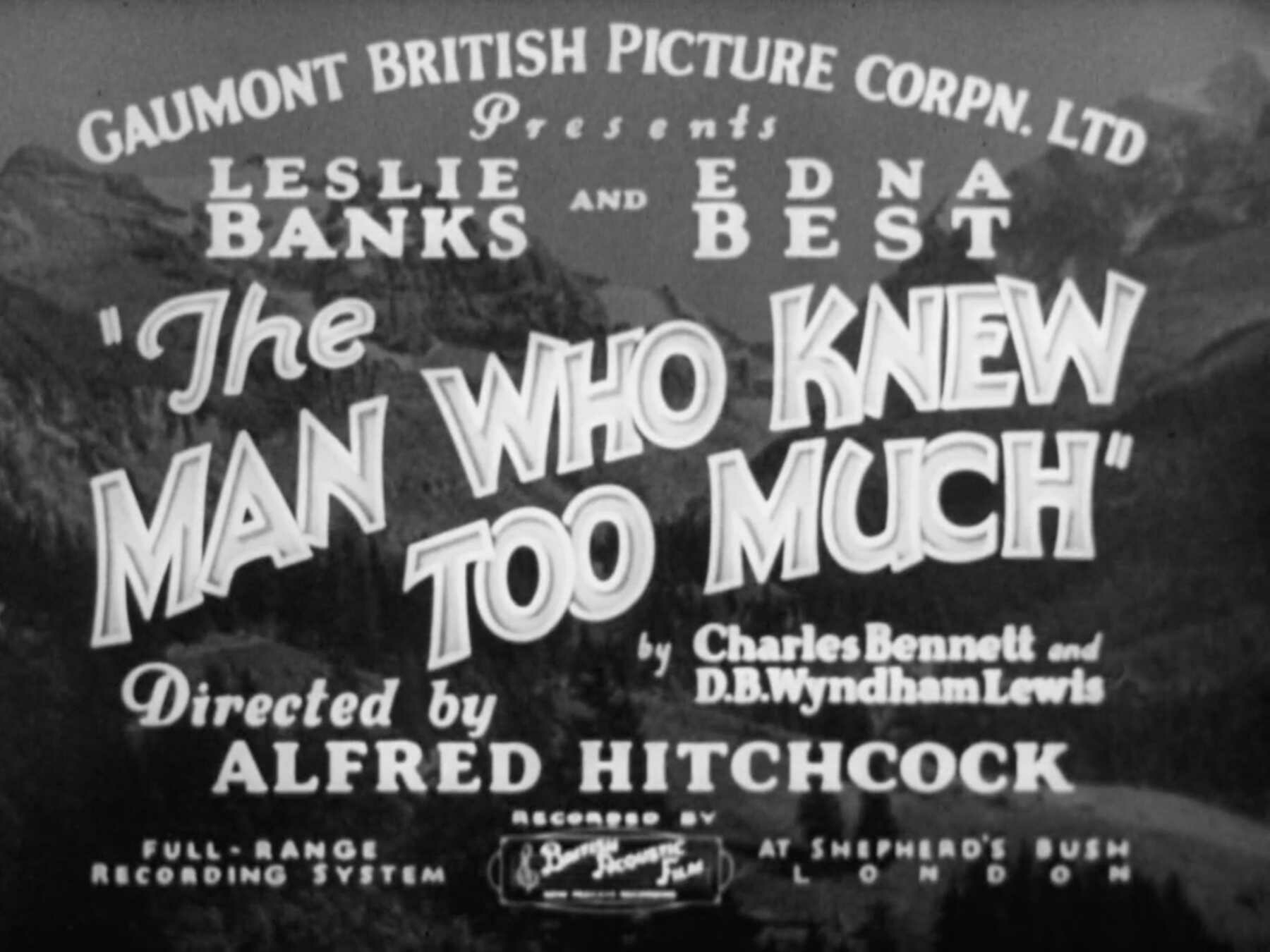
The Man Who Knew Too Much was directed by Alfred Hitchcock and released in 1934 by the Gaumont-British Picture Corporation.
The film stars Leslie Banks and Edna Best as the parents of a young girl, played by Nova Pilbeam. The couple become wrapped up in a plot to assassinate a European head of state when a militant group, led by Peter Lorre, kidnaps their daughter.
This title card was immediately striking, and it ended up being the reason why I thought it would be fun to start a series about them. In this one, there are at least six, and most likely more, different typefaces being used throughout, but it never appears distracting. It’s packed with information, but none of what’s written distracts the eye away from the title of the film. “The Man Who Knew Too Much” is written in a unique, stylized typeface and slashes across the screen in an aggressive curve. The rest of the text is shown in plain, unassuming serifs (save for the bit about how it was recorded at the bottom). It’s impossible not to focus on the title—it grabs at you.
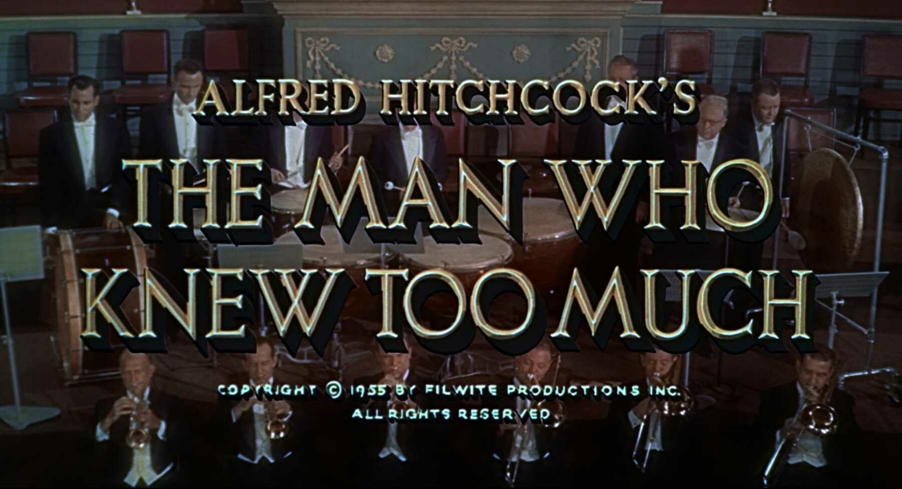
(Be sure to contrast this title card with the one used in the 1956 remake of this film, also by Alfred Hitchcock.)
Also worth watching is the fascinating video from The Criterion Collection about this film’s restoration. Technical director, Lee Kline, narrates the story about their long journey to create a version that looks as if it was just made yesterday. 🎞