- Micro.blog, as its name suggests, is intended to be a blogging-first service with a social media component attached. Communication is the goal, not acquiring followers or likes.
- Mastodon is intended to be social first, with the ability to publish short posts. Communication is important, but so is promotion.
- Speed.
- Personality.
-
Indeed, I’ve not signed up for Threads or Bluesky. I’ve long since stopped using Facebook, Twitter (or X or whatever), Instagram, and the like. ↩︎
- Jog wheel seeking
- Picture-in-picture
- HDR and frame rate matching
- Using Siri to toggle audio and subtitles
-
I mean, look at these things! My mouth is watering already. ↩︎
-
As always, fuck Ajit Pai. ↩︎
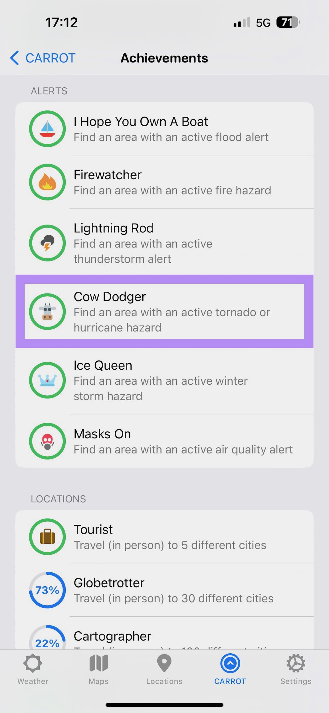
On one hand, I’m a little concerned about this exceptional storm coming through Southern California and I’m being cautious about it.
On the other hand, it’s finally gotten me the “Cow Dodger” achievement in CARROT Weather.
There’s Room for App Improvement
For as long as I can recall, I’ve enjoyed the shiny new things in life. Surely, there’s nobody else out there who can relate to that obsession. Surely. Plop down the new hotness, bonus points if it’s an Apple product, and you’ve just stolen my attention. There’s a sea change happening in the world of social media right now, and it’s difficult to turn away from the noise (which is loud and distracting). My inability to turn away from the shiny things in life leads to perplexing and occasionally anxiety-inducing indecision. Right now, two things are tussling in my mind.
Mastodon. Micro.blog.
I’ve spent the last few days considering what the two services offer and how they do or might fit into my life. They both offer potential ways to stay connected with the world without potentially sacrificing a part of my soul to some careless tech giant. One potential way to solve this dilemma is to use both of them concurrently, finding an elusive best of both worlds scenario that I’m not sure actually exists.
I have a fraught relationship with social media, and my mind works best without exposure to larger services.1 Posting and replying on Micro.blog is enough of an effort for me, and I’m still not good at it (as you can tell from my lack of presence here). I hardly have room in my life for one service, much less two or more.
But what if ActivityPub is the solution? It has the potential to reinvigorate the notion that the web itself is the greatest social network. Why sign up for yet another disconnected service—what’s the count up to now?—when you can choose a favorite and, through internet magic, stay connected everywhere? Lucky for me, ActivityPub is already built into Micro.blog and Mastodon. Problem solved, right?
Not so fast. This whole thing wouldn’t be necessary to write if that were the case. I hesitate to use the word “blame” here, but it’ll have to do. The blame rests on those self-same services. They have inherently different ideologies which don’t play well with each other:
You won’t find public boosts, likes, or follower counts on Micro.blog, and that’s how it should be. On Mastodon, you won’t be able to style a personal website how you want or write a novel-length post, as intended. The services themselves don’t offer any convincing advantages over each other, especially with ActivityPub involved.
That’s a lot of words without a real explanation for my indecision. What’s the point then? There’s a magnetic force, an inexorable draw emanating from the Mastodon side of this issue. A siren call that I’m finding hard to resist.
One app has been enough for me to consider spinning up my own Mastodon instance and giving that service my all. One app has brought joy to my device usage. One beautiful app with character to spare is the reason for all of this. Unlike the Micro.blog app, Ivory has the two most important qualities of any essential app:
I’m certainly not a developer of any sort; in this case, consider me more of an armchair critic. However, I know in my bones that Craig Mod was 100% correct when he wrote that fast software is the best software.
When I open Ivory I feel imbued with the spirit of a certain zippy hedgehog. My fingers feel light and nimble. Every swipe, every tap, every thought becomes quick and instinctual. Get into the zone and Ivory might just feel like it’ll start doing things for you. I hardly have to think about what I’m doing when using it.
When I open up the Micro.blog app I feel a brake pedal depress on my thoughts. Certainly, the 3.0 update fixed many issues, but it still lacks the speed and charm of Ivory. With this app, there’s a palpable sense of waiting. Waiting for new posts. Waiting for new screens to appear. Waiting for too much to visibly load. Each tap introduces a few blank moments, and those add up. Additionally, there’s hardly a swipe action to be seen. There’s no on-screen context while replying to someone. There are no quick animations, fun colors, or neat icons, a.k.a. charm.
I think one reason why enough people asked about using Ivory as a Micro.blog client that Manton wrote a post about their interoperability (or lack thereof) is because it’s such a joy to use. If the two apps were on equal ground, then maybe the post wouldn’t have been necessary.
I think there’s a good future for the Micro.blog app. Certainly, there’s nowhere for it to go but up. The number one priority should be speed. Make the thing lightning quick, to the point where it feels like it’s anticipating my every move. The dreaded loading spinner should be avoided at all costs. I want to see it leave Back to the Future-style burning tire tracks wherever it goes.

Nail that aspect and everything else becomes icing on the cake. From there I’d love to see swipe actions for common tasks, subtle animations for button presses, long-press context menus all over the place, and maybe even some fun custom app icons. Make the app feel less utilitarian and more like a communication compatriot who likes to party a little bit.
I hope these aren’t new ideas for anyone working on the service and/or app. If they are, then please consider these thoughts my official feature requests. The Micro.blog app has the potential to be just as lively and joyful to use as Ivory. As one of the main methods of interacting with the service, it has an obligation to be. I think it can get there—it’s come a long way—and I’m rooting for it.
Max just debuted and, yep, it’s just as I believed it would be.
With everything that’s been happening at Warner Bros. Discovery, including that horrid CNN town hall event, I’m looking at investing far more time and hard drive space into Plex than ever.
UPDATE: After several hours of considering this app, I’ve committed to leaving it behind. Gone are the halcyon HBO days; Max is the final nail in that sad coffin.
Max, in its current form, appears to be just a reskinned HBO Max app—new colors, the same big header images, and a sidebar navigation (but with the addition of an inexplicable top menu too). It seems like they could have kept the old app and just changed the name. Why this needed a completely separate app is beyond me. Let’s just call it corporate stupidity.
That’s where the similarities stop. The most egregious issue is the return of the custom video player that no one was asking for. Doing this means Max has dropped all support for the standard tvOS interface and features. “Regression” is the only word for this. This means Max doesn’t currently offer:
This is breaking long-held and valued conventions, all for the benefit of tracking every single second of watching time and every single choice made within the app. Make no mistake, these changes have been done so that WBD can architect profiles of its users and, likely, sell that information to advertisers. In a less nefarious way, it’ll also likely be used to inform future content spending and acquisitions.
This is a 1.0 release (even though it didn’t need to be), so I’m interested to see how it’ll evolve; HBO Max wasn’t particularly great when it was first released either. However, if they’re not going to learn from past mistakes, then I don’t have to give them any more attention and money.
We’re all pawns in the war between streaming giants. The best way to stay clean is to stay out of the skirmish.
For the first time in over a decade (and maybe even since getting my first iPhone), I’m seriously considering moving something out of my Dock. Marvis Pro may be one of the finest apps I’ve ever had the pleasure of using. It’s definitely nicer to use than the stock Music app.
The new Apple Music Classical app is a refined and focused experience. I’ve immediately gotten much enjoyment out of what it provides. It gets a hearty recommendation for any fan of the genre.
It’s still a shame that it’s not yet available for iPad or Mac. What an easily avoidable fumble.
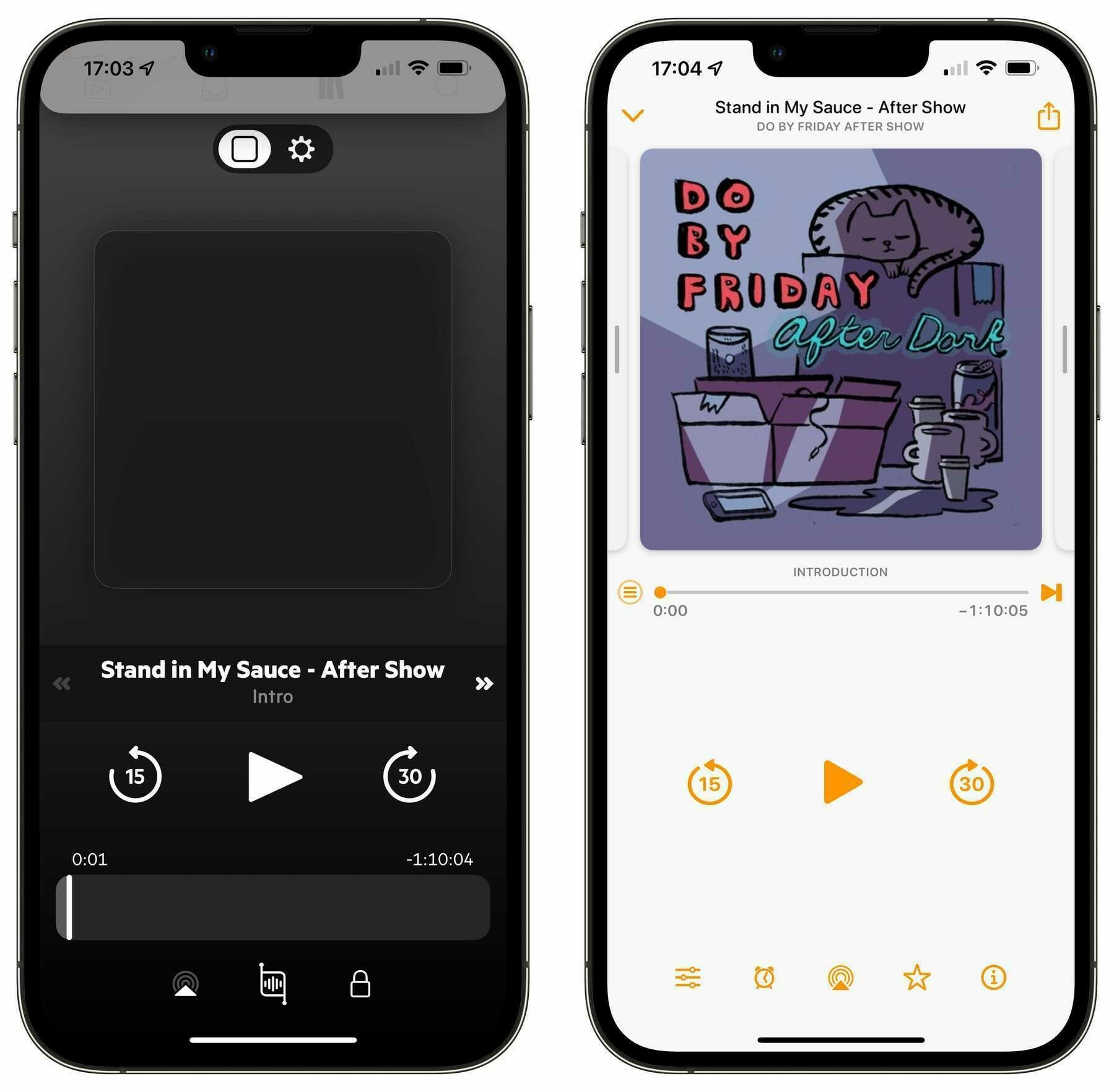
At long last, Castro has been updated. To call me underwhelmed would be an understatement. It took them over a year to give it a slight visual refresh? Where’s the promised syncing between devices? Where’s the iPad app?
I’m so glad I switched back to Overcast.
The location-based alerts in Reminders are, I think, going to be what finally gets me to stop using Things for good.
A lapse of memory made me miss something on a recent shopping trip. Reminders would have prevented it; the long-stagnating Things did not.
A Quick Castro Update
On June 14, I wrote an entry that discussed several issues with my preferred podcast player app. It seems so long ago now; so many things have changed. We’ve all grown a little older and, I hope, a little wiser. To the second point, I’ve decided to cease an activity that’s proving itself to be a waste of my time.
I don’t want to bury the lede any further: I’ve stopped using Castro entirely and have returned to Overcast.
I’ve also canceled my long-held subscription with Castro because I no longer feel that my money is being used to support the development of this app. Instead, it appears that my money is being taken from me with nothing given in return.
Since writing the initial entry, I’ve followed up every subsequent month with a short update on Twitter. Normally, I wouldn’t care to use that place for anything, but it’s historically been where Castro’s developers have been most available. I figured that a mention there could make its way to their eyes. So far, I’ve been proven 100% wrong.
Not only has there been no communication with me, but there’s been no communication from them with anybody. By all appearances, the Castro podcast app has been abandoned. There’s been no official announcement about this, so take what I’m saying with a grain of salt, but the app hasn’t been updated in over half a year. Additionally, it’s been nearly two years since there was any mention of their iPad app and sync service. What else should I conclude from this behavior?
I acknowledged in my original entry that software development is an inherently time-consuming and difficult process. I would never demand that any developer finish large projects in an unreasonable amount of time; we all have personal lives to live. What irks me is the complete lack of communication from a company that provides a product to the public. Castro’s developers used to update and communicate regularly, and now they do not. I don’t find that acceptable when other people’s money is involved.
I’m saying goodbye to Castro and hello again to Overcast. Its developer, Marco Arment, has not only proven himself to be capable of regular app updates, but more importantly, he’s open to communication in several different places. I feel confident that if anything were to ever happen to Overcast, then he would tell everybody.
I see more commitment to and progress made on Overcast than I’ve seen on Castro in a long time. More importantly, I don’t feel like my subscription to his app is being taken advantage of.
This is a damn shame. Not because I don’t like Overcast—I do—but because I really liked what Castro did for listening to podcasts. The episode triage system worked especially well with my listening behavior and it was a well-made app. Unfortunately, it’s become riddled with bugs, the developers have fallen off the planet, and it’s completely missed the boat with the recent iOS 16 launch. Even if they came out with an update tomorrow and renewed their interest in communicating online, I wouldn’t use Castro again. What assurance would I have that they wouldn’t fall back into their bad behaviors sometime in the future?
There comes a time when a person should stop foolish endeavors and accept what’s already there for them. Expecting an untrustworthy company to completely change forever is like expecting chocolate chip cookies to not be delicious. It’s just not going to happen.1
I expect to be done with these entries forever unless a Castro update magically appears, and even then, don’t bet on it. In the meantime, I’ll be busy listening to podcasts on Overcast.
Having to delete and redownload my apps to get their Lock Screen widgets to become available is not a great first experience with iOS 16.
It’s all working well now, but that was a confusing and a little frustrating.
Delete TikTok from app stores, says FCC commissioner to Apple and Google ↗
From Ben Lovejoy at 9to5Mac:
An FCC commissioner has called on both Apple and Google to delete TikTok from their respective app stores, giving the companies until July 8 to respond. […]
The lengthy four-page letter says that TikTok is not a video-sharing app, but a “sophisticated surveillance tool” for the Chinese government …
That’s a pretty damning but unsurprising development in the continuing U.S. vs. TikTok skirmish. Where it concerns this issue, the next week and a half is going to be interesting. I imagine it’s relatively rare that the U.S. government passes such a weighty edict to companies like Apple and Google (although that’s undoubtedly going to become more frequent).
These days, it also feels rare for the federal government to do much of anything beneficial. I’ll admit that recent events have left me feeling bitter about the whole organization. One need also only look back at the previous administration, and its FCC chairman,1 to form a clear understanding of my disillusionment and that of many others.
However, considering what was detailed in the the BuzzFeed News report that the FCC letter references, this feels like a positive step.
For years, TikTok has responded to data privacy concerns by promising that information gathered about users in the United States is stored in the United States, rather than China, where ByteDance, the video platform’s parent company, is located. But according to leaked audio from more than 80 internal TikTok meetings, China-based employees of ByteDance have repeatedly accessed nonpublic data about US TikTok users. […]
Despite a TikTok executive’s sworn testimony in an October 2021 Senate hearing that a “world-renowned, US-based security team” decides who gets access to this data, nine statements by eight different employees describe situations where US employees had to turn to their colleagues in China to determine how US user data was flowing. US staff did not have permission or knowledge of how to access the data on their own, according to the tapes.
I’ve never been so proud and relieved to have not downloaded and given my personal information to an app. Call me a Luddite or out of touch, but at least the dire issue presented in the BuzzFeed report and this subsequent FCC letter has never been a concern for me.
Count me among the people who believe the world would be better off if social media services of the size and scope of TikTok weren’t so easily accessible.
Tales of Castro Woe
Castro, the podcast player app, is the third-party iPhone app I use the most. Podcasts are a major part of my life, and Castro presents them in a way I find most pleasant. I’ve played around with the others,1 but this one has stuck the longest.
Unfortunately, over the last year, Castro has become one of the buggiest apps on my phone.
The quality of the app, its relentless pace of innovation and keeping up with modern iOS technology, and the communication from the development team have become lackluster. I was disappointed to find myself casually looking for replacement apps and just as disappointed to discover that none of them manage podcasts in quite the same way.
I have a few glaring issues with the app. I’m sure I’m not the only one with issues, so this list isn’t exhaustive and may not be typical.
Lack of developer communication
On the company’s Twitter page, which had long been a reliable source of information, you’ll find that their last communication was on March 29. Well over a month ago, as of this writing. Their support account is similar.
Their last app update was released four months ago, according to the version history of their App Store page. It was a small bug fix update (which is, of course, always welcome).
I understand that app development is inherently complex, time-consuming, and challenging. Their lack of communication is surely attributable to the upcoming iPad app and sync service. I imagine (and hope) that they’re hunkered down and making it happen.
However, to allow the currently released app to quietly degrade and not manage the growing number of issues is disheartening. To stop communicating with their users borders on unacceptable. It makes me feel like I’m paying a subscription for an app that’s been abandoned.
This is an unfortunate turn and makes talking with them feel like shouting into a void.
Missing podcast artwork bug
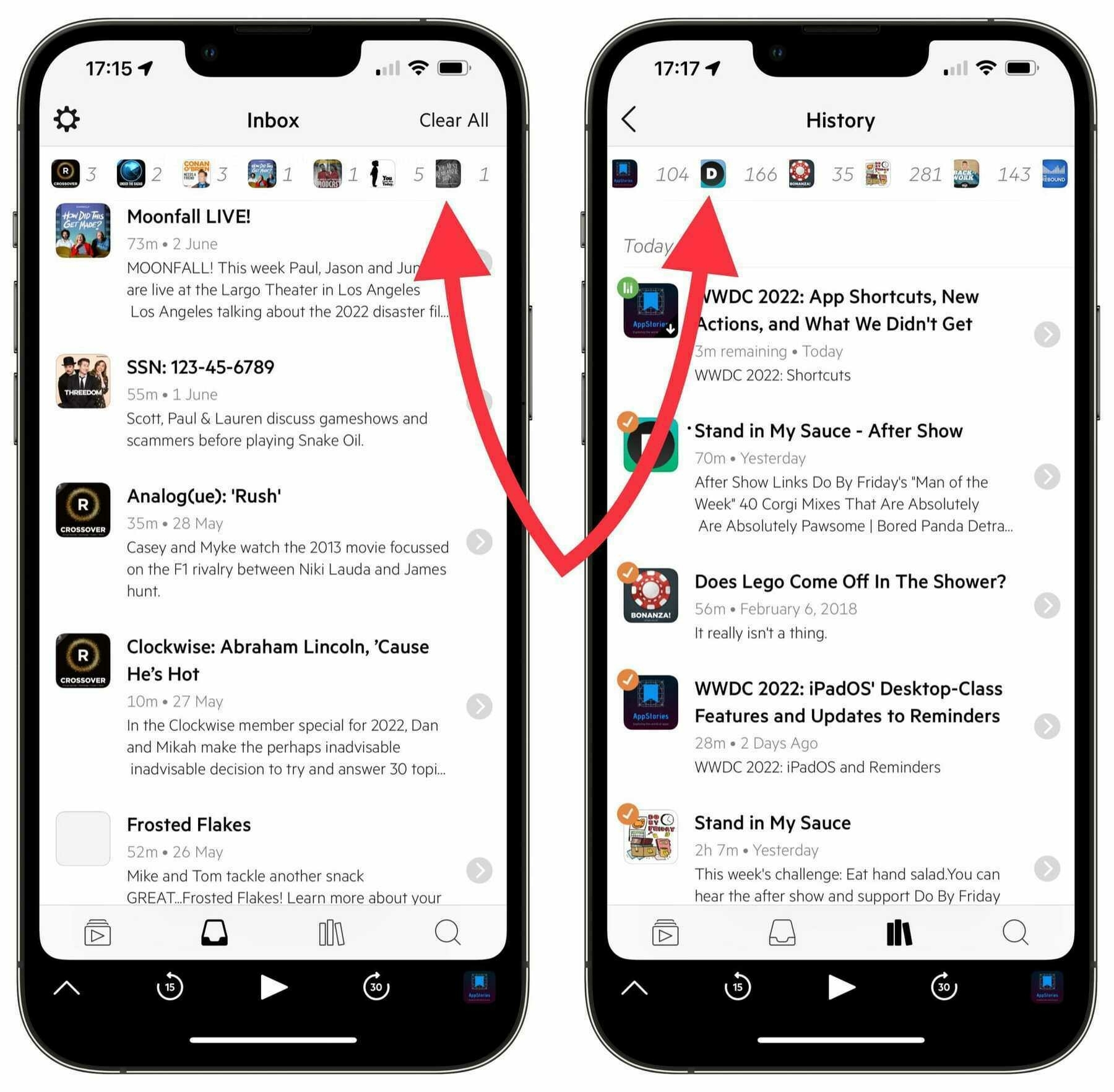
Over the last several months, the main artwork for a growing handful of the podcasts I subscribe to has disappeared. What started with a single show has now infected three. I counted seventeen podcasts with missing artwork while browsing through my History page in the app.
It doesn’t matter if it’s a free show or if I’m paying for it. There was no warning, and there appears to be no way to fix it. I’ve tried power cycling my phone. I’ve tried unsubscribing and re-subscribing to the shows. I’ve tried deleting the app and downloading it again. All that greets me from some shows is missing artwork.
Other podcast players don’t have this issue. Overcast, for instance, shows the artwork in all its glory; Castro only shows a dark square.
Disappearing episode/settings toggle bug
At the top of the playing screen, there’s a toggle to switch between the playback controls and playback settings for the current episode. It’s an easy way to travel between those two screens.
While a podcast is playing, slowly pulling down the shade to show the Queue/Inbox/Library/Discover pages will cause that toggle to shift itself upwards, hiding and making it difficult to interact with.
Pulling the shade all the way down and then moving it back up to show the playing screen again will put the toggle back in its place.
Spacing issue with icons in the top bar of the Inbox screen
At the top of the Inbox screen, there’s a handy row of shows that have episodes awaiting triage. Several of those shows have shifted themselves to the left, obscuring a portion of the small artwork icon. It’s as if the margin between those items isn’t being respected.
This also happens, and more egregiously, in the History screen of the app.
This has been a long-standing issue with the app, or at least my downloads of it, and has followed me over several new devices. I’m beginning to lose hope that it’ll ever be remedied.
Slowing development pace
I mentioned earlier that app development is a complex and time-consuming process. I don’t expect large-scale updates or even small issues to be completed in an unreasonable amount of time.
I want the developers of Castro to live full lives outside of their app work. They shouldn’t be tied to their computers all day, every day.
However, it’s hard to look at an app like Overcast, which received a major redesign a couple of months ago, and not feel a bit envious. While the developer, Marco Arment, has made major improvements and continued fixing bugs, the team behind Castro has done neither and not talked about it.
According to the Credits page in Castro, the development team currently has three people working on the app. I don’t think it’s unreasonable to imagine that three people should be able to accomplish things faster than a single person.
I wouldn’t think of demanding anything from the developers of the apps I use. They’re human beings and deserve time and respect in their work and personal lives. They will never owe me service, coddling, or even a development timeline, even if I am paying for their app.
What I’m ultimately asking for is better communication from the developers of Castro. If it’s slow going with the sync service, fine. Let us know. If the iPad app is proving troublesome, fine. Let us know. If there are bug fixes on the way, fine. Let us know.2 If you’ve got a cool idea for the app or everything is going swimmingly, great! Please tease us with some scant details.
A vaguely passive-aggressive tweet shouldn’t be sufficient. A company that deals with the public shouldn’t be averse to sharing with the public.
I love Castro and I want to continue using it, especially on all of my devices. In the meantime, I feel that many of its users, myself included, would appreciate, at the very least, bug fixes and some sort of indication that it’s not going to be left to wallow in the Museum of Once-Amazing iPhone Apps.
Can I just delete the phone app from my iPhone?
I mean, I know I can’t, but I happily would given the opportunity. I can’t name a lesser-used app than that one.